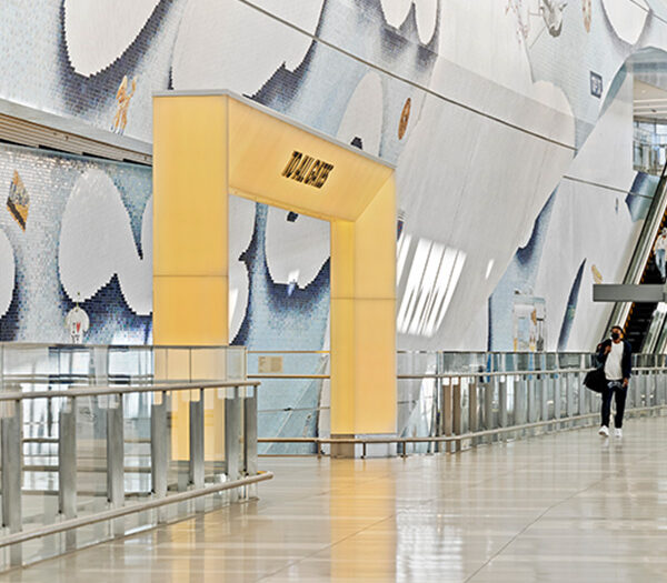
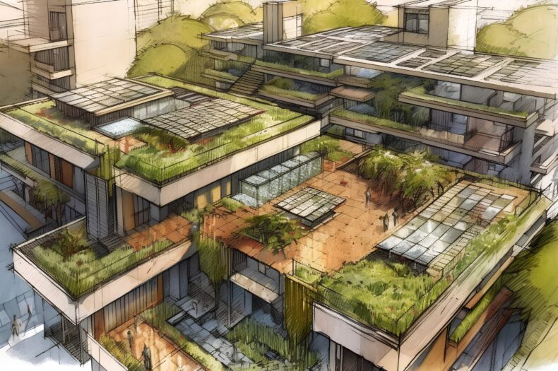
Thursday Salute to Originals: The Eggnog Project

Madeleine Eiche has an affinity for eggnog. For this graphic designer, the appeal of eggnog is not in its ability to be spiked, but for the packaging on the outside. While working at a coffee shop earlier in her career, Madeleine always noticed the kitschy eggnog cartons with their mismatched fonts and chaotic colors. Drawing a parallel to Warhol’s tomato soup cans, the designer imagined elevating this mundane piece of holiday consumption to pop art.

Eggnog Carton Graphic Design Fonts Colors

Madeline continued to collect eggnog cartons, grossing a broad collection that is as much a study of bad typography as it is a collection of nostalgic holiday-ware . “The peculiarities of the packaging range from festive to banal, minimal to unappetizing, and each seem to be printed with complete disregard for color alignment. It is precisely these things that make for such compelling kitsch”, describes the designer.

Eggnog Carton Graphic Design Collection

So whether you’re donning your favorite ugly Christmas sweater, watering your Chia Pet, or simply admiring your aluminum Christmas tree today, we salute all those kitschy things about the holiday season that make it so special, and hope that all of you – our blog readers, colleagues, clients, and co-creators – get to enjoy the same! Happy holidays and we will see you in the new year!

Image credits: If It’s Hip, It’s Here, The Eggnog Project