In this Impactful Entry Space blog series, we will feature a designer or artist that has created an attention-grabbing design for the main lobby space of a building. Drawing inspiration from completed entry spaces around the world, we travel beyond the image by diving into the design process and concepts behind it.
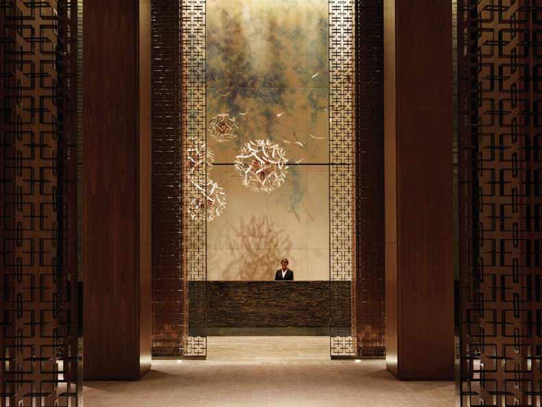
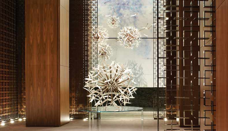
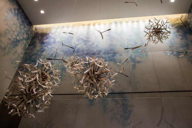
Today, we feature our interview with Mark Davison of Wanders & YOO about the lobby design of Mira Moon Hotel in Hong Kong.
GPI Design: What did the lobby space mean to the building as a whole?
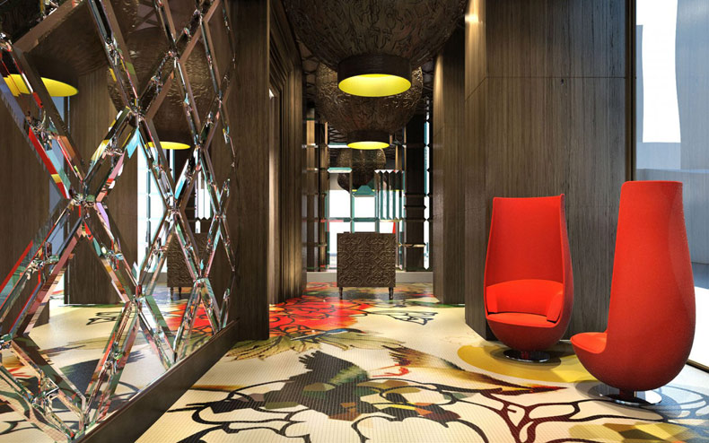
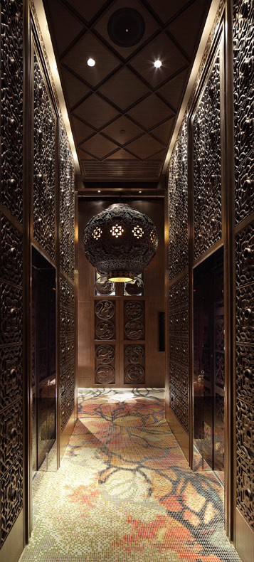
Mark Davison: A hotel is an opportunity to create a fantasy world, where guests can escape the everyday and the lobby must embody this. The lobby is the first encounter the guest has with the interior of a hotel – it is the start of the story and therefore is one of the most important aspects of a hotel. When developing a design concept for a hotel, we can be outlandish and playful, creating a space that is fun and whimsical to be enjoyed for a finite amount of time. The design is not one the guest has to live with on a daily basis but one that provides an escape from reality. The Mira Moon Hotel in Hong Kong is an excellent example of this, designed by Wanders & YOO around the poetic and romantic Chinese fable of the moon goddess.
GPI Design: What were your functional and conceptual goals for the lobby?
Davison: At the Mira Moon the guest can journey to the moon and back without ever leaving the hotel. Aspects of the story unfold in elements throughout the hotel, each space is a new chapter and tells the next part of the tale. The lobby is where the story is first introduced, and it must set the right tone while embodying the design concept. Functionally a lobby must welcome and guide guests through the hotel but beyond that the lobby has the function of setting the tone for the entire guest experience. The lobby of a hotel is that initial ‘hello’ or first impression and therefore is key in establishing the personality of the hotel.
GPI Design: How did you use specific design tools (such as color, form, materiality, lighting) to create the space?
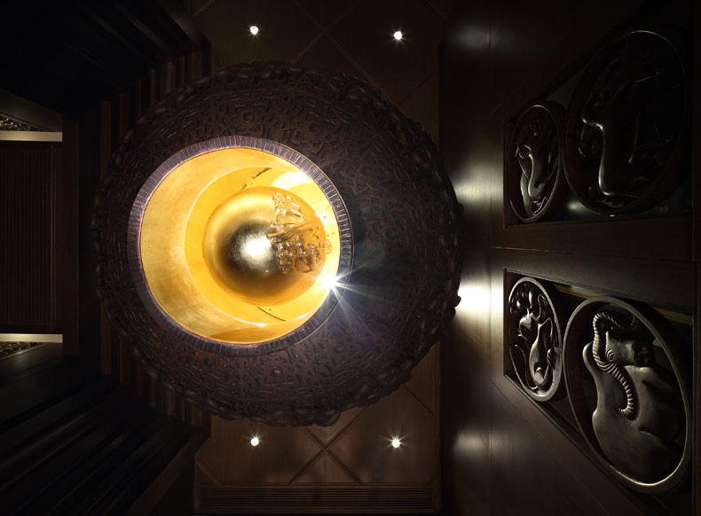
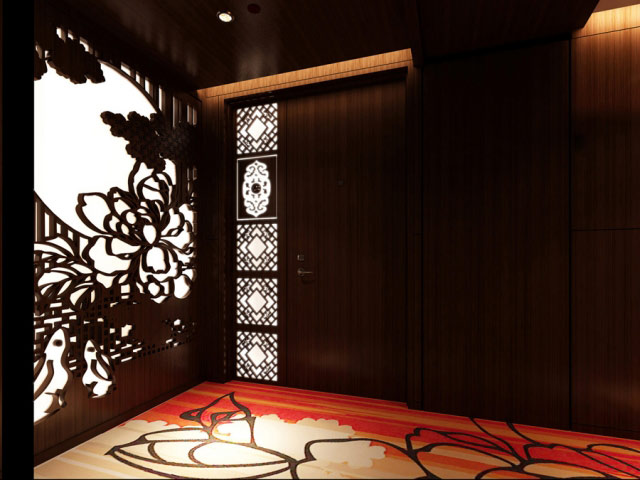
Davison: The ancient Chinese folk story the design is centred around has many facets which were drawn upon to create an immersive sensory experience. The aim is to delight the customer at each and every turn. The characters of the story – the moon goddess, rabbit and the moon are represented by 3 handcrafted timber lanterns with pendants each symbolising the characters. Reference to the folk story also features in the images and the use of the Peony flower on the walls in the corridor, the carpet and the printed ceramic tiles. Other details can be found in the lucky charm feature wall in the foyer which represents the signs of the Chinese zodiac for prosperity.
GPI Design: What makes this space impactful?
Davison: The design concept is also inspired by the legacy and beauty of Chinese craftsmanship with the use of ceramic, carved timber and cut crystal materials throughout amenity spaces. These materials not only pay homage to Chinese workmanship but also relate to the Dutch influences and inspirations inherent in Wanders & YOO. This combination of Dutch and Chinese heritage has given the lobby a unique vibrant style with the twist of Wanders & YOO artistic expression, the uniqueness of the design is what provides a true impact when a guests first enters the Mira Moon hotel as it is unlike anything that has come before.
______
Many thanks to Mark for sharing the design inspiration for this space. Stay tuned to our next Impactful Entry Space interview coming up in two weeks. For more visual inspiration, follow our Impactful Entry Space board on Pinterest.
Comments Off on Impactful Entry Space: Melia Vienna Flow Bar
In this Impactful Entry Space blog series, we will feature a designer or artist that has created an attention-grabbing design for the main lobby space of a building. Drawing inspiration from completed entry spaces around the world, we travel beyond the image by diving into the design process and concepts behind it.
Today, we feature our interview with Christian Jabornegg of Jabornegg & Palffy about the lobby design of Melia Vienna Flow Bar in Austria.
GPI Design: What did the lobby space mean to the building as a whole?
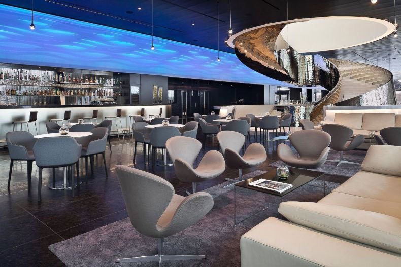
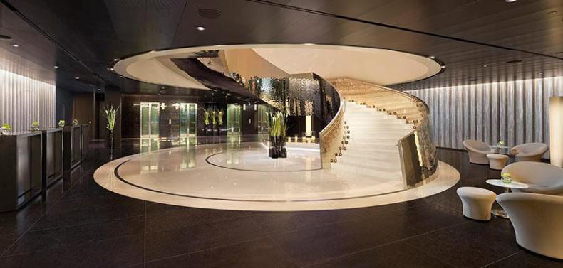
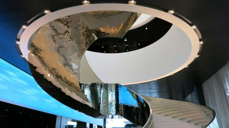
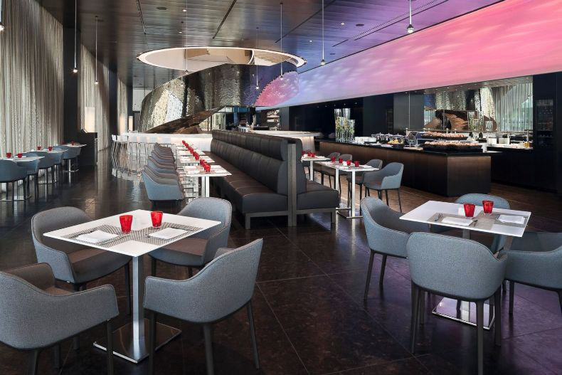
Christian Jabornegg: The lobby creates an identity in the interior and orientation and an overview.
GPI: What were your functional and conceptual goals for the lobby?
Jabornegg: The architectural concept of Dominique Perrault forms the basis for our interventions, which on the one hand underline the existing concept with simple measures and the smallest possible number of elements, and on the other hand continue an independent development for the client, for example with the 40m long light strip of level0, which enables different lighting moods and movements. Simple measures are not only justified by economic reasons, but also the intention to highlight the fundamental meaning of the intervention, irrespective of the scale of the action.
GPI: How did you use specific design tools (such as color, form, materiality, lighting) to create the space?
Jabornegg: The predefined architectural design concept forms the basis for our considerations. In order to let the spatial and sculptural qualities of the cone-shaped staircase unfold, it was essential to choose a non-transparent material and surface and pay attention to its detailed design. The detail becomes the contour, because it is always the materialized expression of a concept and inseparably linked to it in order to be understood.
GPI: What was the biggest constraint in turning the design into reality?
Jabornegg: Constraints are challenges that can improve the result.
GPI: What makes the space impactful?
Jabornegg: For us, the question of perceptible qualities is not linked to spectacular design objects, but means clearly showing meanings, and being able at the same time to develop their spatial qualities is the aspect which is our starting point to work out typologically clear but highly specific solutions within a context.
______
Many thanks to Christian for sharing the design inspiration for this space. Stay tuned to our next Impactful Entry Space interview coming up in two weeks. For more visual inspiration, follow our Impactful Entry Space board on Pinterest.
Comments Off on Impactful Entry Space: Museum of Fire
In this Impactful Entry Space blog series, we will feature a designer or artist that has created an attention-grabbing design for the main lobby space of a building. Drawing inspiration from completed entry spaces around the world, we travel beyond the image by diving into the design process and concepts behind it.
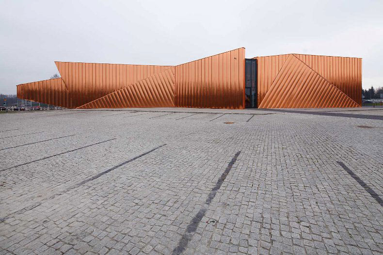
Today, we feature our interview with Oskar Grabczewski of OVO Grabczewscy Architekci about the lobby design of the Museum of Fire in Zory, Poland.
GPI Design: What did the lobby space mean to the building as a whole?
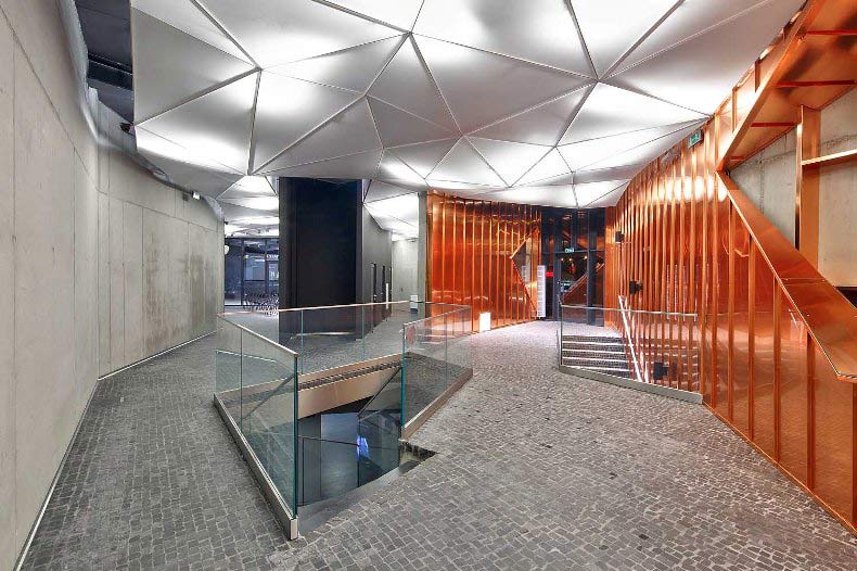
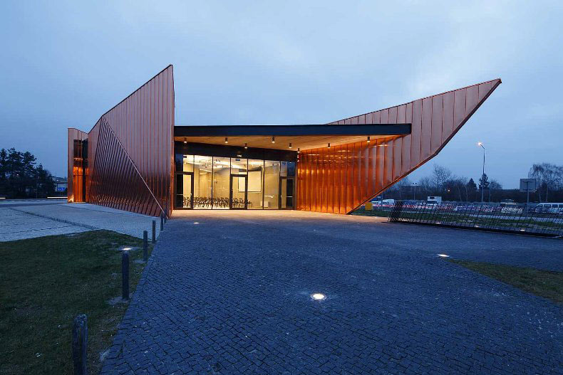
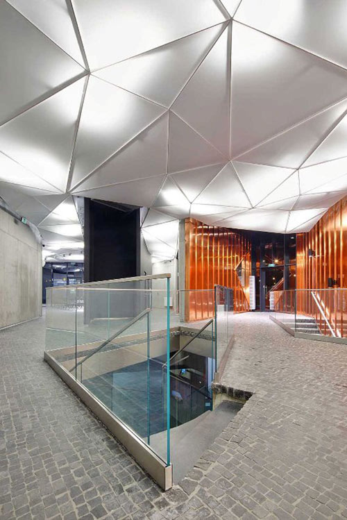
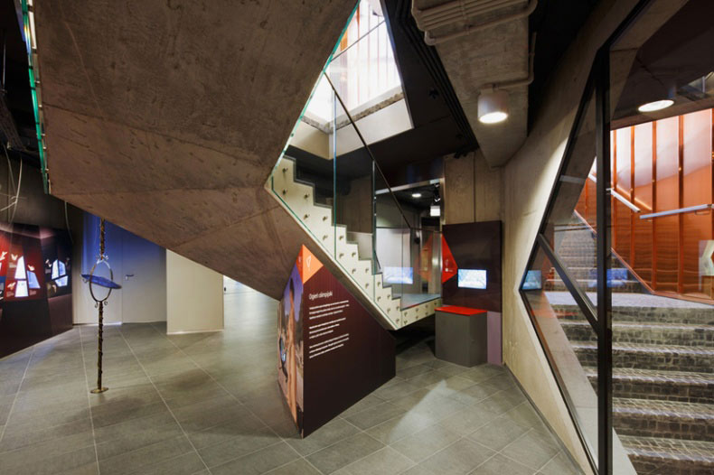
Oskar Grabczewski: The building in fact is a continuous lobby. The Museum has three entrances and they are all connected via uninterrupted, flowing, multifunctional space – a lobby that is also an exhibition hall. Our idea was to create continuity between outside and inside of the building.
GPI: What were your functional and conceptual goals for the lobby?
Grabczewski: The lobby is the most important space in the building. It contains reception, exhibition and multifunctional spaces connected to each other. Our concept derived from the name of the city – Żory means “fire”, ”burnt”, “flames”. In XII century, when Żory was founded, forest was burnt in order to create free space for the new city. This tradition is still alive – there is a Festival of Fire in summer, and the logo of the city is a small Flame. It became obvious to us, that a building should look like a fire. The strange shape on the plot suddenly started to resemble dancing flames and the idea started to crystallize.
GPI: How did you use specific design tools (such as color, form, materiality, lighting) to create the space?
Grabczewski: All materials has been chosen according to the main topic of the Museum – that is the phenomena of fire. Fiery copper cladding comes from the outer walls inside, as single flames. The black granite paving stones also flow from outside inside. The walls inside are gray and black – the museum is “fiery” outside, but “burnt” inside. The ceiling is based on triangular pattern similar to the basic geometry grid of the building.
The building consists of three independent walls that “swim” next to each other. Their composition and shapes covered with copper plates resemble dancing flames. Copper is covered with HDP layer in order to avoid patina and keep fiery appearance. Spaces between the walls are fully glazed forming entrances to the pavilion. Walls are made of architectural concrete, covered on the outside with copper and left untouched inside. The floor is paved with black stone, and continued to the outdoor elements.
Intensive landscaping is surrounding the Museum. The building and the landscape work together create a symbiosis of space consisting of Museum itself, pedestrian paths running through the pavilion and green walkways. There is a Garden of Fire foreseen – an outdoor exhibition space along the country road nr 81 that will be used during Festival of Fire.
GPI: What was the biggest constraint in turning this design into a reality?
Grabczewski: We had much trouble finding material that looks fiery but doesn’t age nor oxidize. It took us a lot of time to find the final solution – copper covered with thin HDP varnish similar to car lacquer.
GPI: What makes this space impactful?
Grabczewski: The space has original geometry, high quality materials and good proportions, but the most important thing is that the lobby corresponds to the whole of the building and expresses the main idea of the building – notion of fire as physical, cultural and social phenomena.
______
Many thanks to Oskar for sharing the inspiration for this lobby design.. Stay tuned to our next Impactful Entry Space interview coming up in two weeks. For more visual inspiration, follow our Impactful Entry Space board on Pinterest.
In this Impactful Entry Space blog series, we will feature a designer or artist that has created an attention-grabbing design for the main lobby space of a building. Drawing inspiration from completed entry spaces around the world, we travel beyond the image by diving into the design process and concepts behind it.
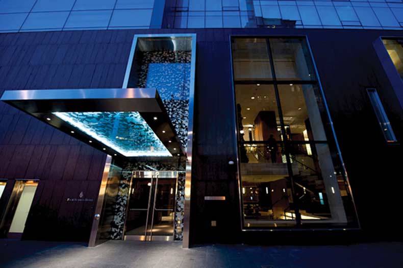
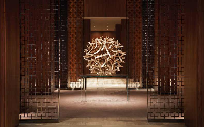
Today, we feature our interview with Gary Thornton of Neo Light Design about the lobby design of the Four Seasons Hotel Toronto.
GPI Design: What did the lobby space mean to the building as a whole?
Gary Thornton: The Main Lobby’s impressive double height central space serves as a welcome entrance portal and space to the Flagship property for Four Seasons, as well as providing a physical link to adjacent areas. The central lobby feeds to the grand reception desk, waiting areas, and break out seating areas for relaxing near the bar. A central space providing a plethora of options for the guests.
GPI: What were your functional and conceptual goals for the lobby?
Thornton: The lighting was designed to complement both the architecture and the interior design, as well as the overall client vision. This included the expected standard of a Flagship property for the Four Seasons hotel group as the operator.
Simply put, it was to set the standards for luxury hotels in the city and the world.
Careful consideration was taken with the detailing to ensure that our lighting was incorporated into various elements of the architecture and interior design. Hidden light sources were heavily used so that you see the lit effect, and not the light fixtures themselves.
In a double volume height space maintenance of a busy hotel was always going to be difficult and inconvenient. LED and long life efficient light sources were used to ensure that this would be kept to a minimum over the coming years and would reduce any impact on the running of the hotel.
In particularly awkward spaces fibre optic light sources were utilised to provide the illumination at high level to reduce any potential maintenance issues here.
GPI: How did you use specific design tools (such as color, form, materiality, lighting) to create the space?
Thornton: Significant sculptural artworks suspended above the reception and within the centre of the space are carefully lit to bring them to life, highlighting their forms to create depth and interest in the large volume.
A warm white colour temperature was generally used throughout the lobby during the day, with the low voltage AR111 lamp sources warming slightly towards 2700K as they were dimmed on the control system for a more intimate feel during the evening and night.
Large metal screens that help form part of the hotel’s identity are made up of 50,000 individual pieces and lit with both in-ground uplights and downlights to add sparkle and drama.
The screens on the raised platforms that flank either side of the lobby space are lit using linear LED lights hidden within the form that shimmer as you walk through, helping to create the feeling of privacy to the seating areas below.
High efficiency cold cathode is concealed in coves to create an overall softness to the lighting with high output lamps on a timed scene set system being used to then focus on art and various other features within the space.
GPI: What was the biggest constraint in turning this design into a reality?
Thornton: One of the biggest hurdles was ensuring that we were compliant with all of the local codes and varying regulations that are present within Canada. There was a lot of initial concern over which regulations were the exact requirements to be followed, ranging from Canadian (national), through to Ontario (provincial), Toronto (city), or Yorkville (district). National codes set the minimum values for some aspects, whilst some others are superseded at district level.
With a limited budget for light fixtures that was further value-engineered, we worked extremely hard to ensure that we complied with all of the necessary documentation without comprising on the design.
Being able to meet and sign off all of these requirements was a huge milestone for us as the responsible consultant, and for Four Seasons to ensure that the hotel could open on time.
GPI: What makes this space impactful?
Thornton: The fact that it is just the first impression of the wider guest experience. The lobby serves a stunning welcome point, yet offers multiple functions subtly linked together. Carefully considered aspects of the interior design are brought to life with specially focussed lighting, and an automated scene set system ensures that the hotel looks as good as possible at all times. The lighting gradually shifts throughout the day from a bright and airy space to read a newspaper in the morning to a more intimate and ambient space to meet for drinks or dinner.
The lighting extends out from the lobby throughout the rest of the public areas and guestrooms in a similar manner, linking areas and bringing people on a journey through the hotel.
Overall the lighting is a subtle yet important element of the hotel and helps to create the feeling of stylish sophistication that the hotel delivers.
______
Many thanks to Gary for sharing the inspiration for this lobby design.. Stay tuned to our next Impactful Entry Space interview coming up in two weeks. For more visual inspiration, follow our Impactful Entry Space board on Pinterest.
In this Impactful Entry Space blog series, we will feature a designer or artist that has created an attention-grabbing design for the main lobby space of a building. Drawing inspiration from completed entry spaces around the world, we travel beyond the image by diving into the design process and concepts behind it.
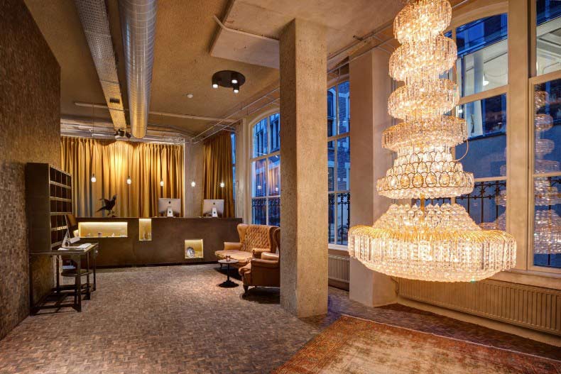
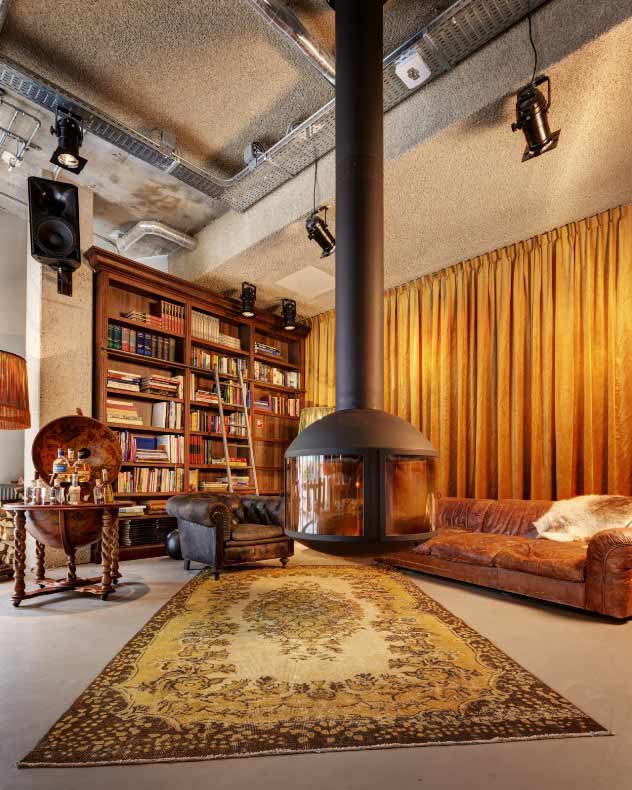
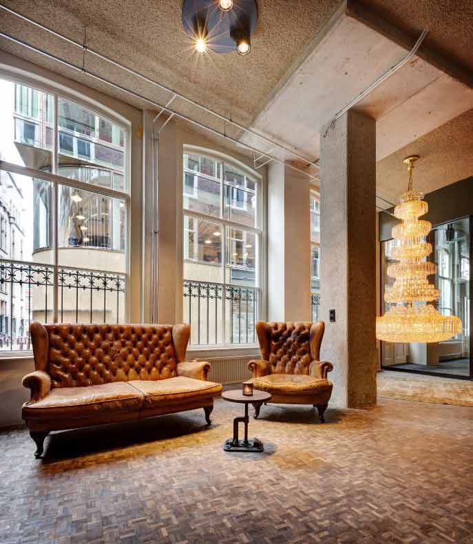
Today, we feature our interview with Mirjam Espinosa, hotel owner and designer, about the lobby design of Hotel V Nesplein in Amsterdam.
GPI Design: What did the lobby space mean to the building as a whole?
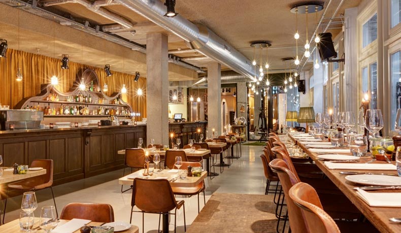
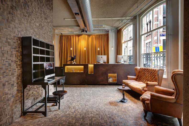
Mirjam Espinosa: The Lobby is the beating heart of the hotel, the centre. It is a unique place where Amsterdammers and internationals can meet and converge. With a bar, a restaurant, an open fireplace, a reading library, a terrace overlooking the Nesplein, and a small stage for events, The Lobby will become a beautiful example of a “Living Lobby”.
This space is meant for all guests; hotel guests, tourists and locals. All type of guests would be able to spend the entire day in The Lobby if they pleased, not having to even leave once. It is a place where locals and hotel guests come to work, relax, socialize and enjoy a high quality drink, snack or meal.
GPI: What were your functional and conceptual goals for the lobby?
Espinosa: We wanted it to be the most important space of the hotel, located on the ground floor, close to the reception and in the same space as the restaurant and bar. In fact, the whole ground floor area is one big open space. This creates a buzzing atmosphere of people checking in and out, people having drinks or dinner, people working on their laptop etc. Hence the term: ‘Living Lobby’: a place where something is happening. We wanted this buzzing vibe to be picked up as soon as you entered the building. Whether you were coming in as a hotel guest or local.
GPI: How did you use specific design tools (such as color, form, materiality, lighting) to create the space?
Espinosa: With a style mixed between chic and raw, the interior of The Lobby breathes a warm and intimate atmosphere. We wanted to create a mix between industrial elements in luxury vintage, with an almost 30’s feel to it, setting. The repurposed theater chandelier in the entryway, the vintage rugs and couches, the old school bar and the library around the open fireplace contrast with the hard industrial pillars, the exposed pipelines and concrete floor and smoked oak flooring the reception area.
GPI: What was the biggest constraint in turning this design into a reality?
Espinosa: We didn’t have big constraints actually, but we did have some challenges. The two biggest challenges were the budget and the time pressure. We had a very tight schedule before the opening and our budget wasn’t that big. But despite of these two aspects we managed to put down a valuable and good product on the market and that was our goal.
Another challenge was to create a subtle reference to the theatre, since The Lobby is situated in a very famous theatre district in Amsterdam. In our opinion we succeeded to do this without being excessive.
GPI: What makes this space impactful?
Espinosa: What makes this space impactful is that we have actually succeeded in what we had in mind. The lobby area has become a very buzzing and pleasant space for our guests to pretty much do whatever in. It is very popular with the locals, which creates an amazing energy combined with the internationals. You pick up on this vibe as soon as you walk in the door, which is a great and welcoming feeling.
We wanted the lobby to become the heart and soul of the hotel, and it has become just that. There is always life. From the moment you walk in you are feeling at home. We think that’s something everybody wants.
______
Many thanks to Mirjam for sharing the design inspiration for this space. Stay tuned to our next Impactful Entry Space interview coming up in two weeks. For more visual inspiration, follow our Impactful Entry Space board on Pinterest.
In this Impactful Entry Space blog series, we will feature a designer or artist that has created an attention-grabbing design for the main lobby space of a building. Drawing inspiration from completed entry spaces around the world, we travel beyond the image by diving into the design process and concepts behind it.
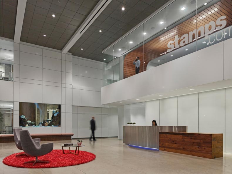
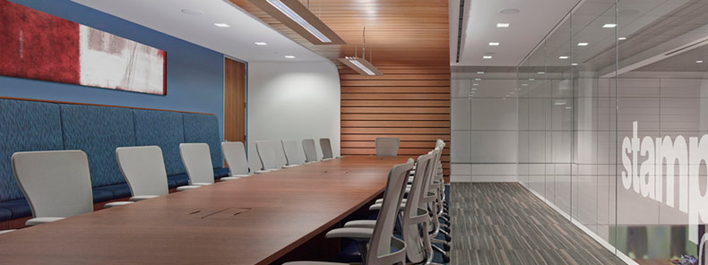
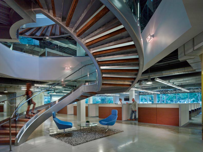
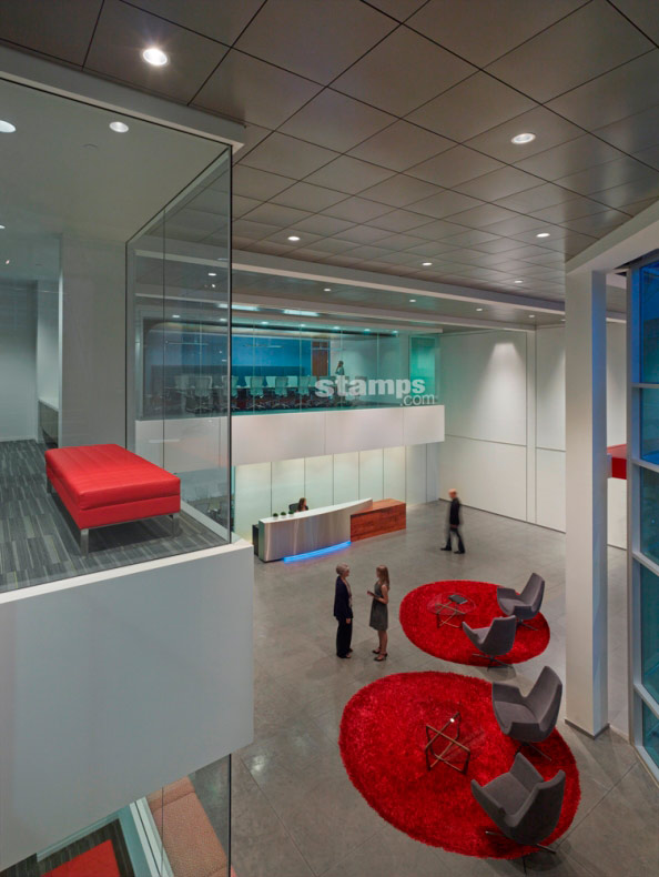
Today, we feature our interview with Sarah Walker of Ware Malcomb about the lobby design of Stamps.com offices in Segundo, California.
GPI Design: What did the lobby space mean to the building as a whole?
Sarah Walker: Our client, Stamps.com, was faced with a challenge while transforming their existing lobby into a new space to reflect their modern, creative brand while still maintaining a professional atmosphere to cater to guests and potential consumers that would walk through their doors. They needed to be sure the lobby design would attract, nurture, and retain the talent that serves as their company’s innovative foundation. Simultaneously, the building lobby needed to cater to guests and prospective consumers, and would serve as the first impressive of Stamps.com.
As a visitor, the lobby acts as a portal. It immediately announces your arrival into Stamps.com’s culture and brand. With the lobby connecting the two buildings, it also serves as an intersection for employees to connect and collaborate. In order to meet the shifting demands of the workplace, improved building amenities were a must. The lobby was home to the conference center and a large canteen that provided a snack service, pool table and a large, two-story water feature.
GPI: What were your functional and conceptual goals for the lobby?
Walker: The goal was to move away from the traditional lobby into more of a foyer or interactive type setting. The end goal was to create a space that was an extension of the office, but still maintaining the primary function of receiving guests. The solution was a spacious, large volume, high energy, active environment with a splash of branding color to mirror Stamps.com’s culture and brand.
The functional goals were based upon sustaining and complementing the everyday operation of the organization. The lobby was divided into two separate zones – employee vs. secured public. The primary entrance to the building was open to the public, which was secured from the rest of the office. The employees would enter the lobby through the full service canteen, only accessible by a card reader.
GPI: How did you use specific design tools (such as color, form, materiality, lighting) to create the space?
Walker: Layering of planes and cantilevered masses were used to accentuate the 2-story volume. These cantilevered elements were a home to the new Stamps.com conference rooms. Each conference room was branded a different color and labeled an adjective that related back to the color. For example, the “Tree House” conference room was emerald green.
A deep dive was taken into the material selection. It was understood that the selection would play a vast role in increased productivity and effectiveness of their employees, yet still tying back to their values – raw, but polished, creative office. Glass with stainless steel accents, polished concrete, and reclaimed wood relate to the Stamps.com brand while enhancing the human experience.
All lighting was intentionally integrated within the architecture to enhance the experience. Some fixtures were programmed to be blue or red to connect the lobby to the office space.
GPI: What was the biggest constraint in turning this design into a reality?
Walker: With the lobby being a new building that connected the two existing buildings, working with existing structure and square footage limitations was a huge constraint. It took close collaboration with the structural engineers and the design team to meet the client’s expectations, yet also be constructible. Working with a challenging existing site to create a clean rational building lobby footprint was very difficult.
Security was also a primary design constraint. The main entrance needed to be secure from the public but allow for fluidity and easy access to the employees. To solve this circulation issue but allow for transparency, a large glass box stair was added which also provided a creative architectural statement to the exterior of the building.
GPI: What makes this space impactful?
Walker: The 2-story volume allows the visitor to feel the grandness of the lobby space as soon as they walk in. The meaning behind the cantilevered conference room overlooking the lobby was to induce a spiritual connection between work and colleagues. This conference room mirrors openness by being a glass structure but also serves as a platform for increased collaboration and effectiveness.
______
Many thanks to Sarah for sharing the design inspiration for this space. Stay tuned to our next Impactful Entry Space interview coming up in two weeks. For more visual inspiration, follow our Impactful Entry Space board on Pinterest.
In this Impactful Entry Space blog series, we will feature a designer or artist that has created an attention-grabbing design for the main lobby space of a building. Drawing inspiration from completed entry spaces around the world, we travel beyond the image by diving into the design process and concepts behind it.
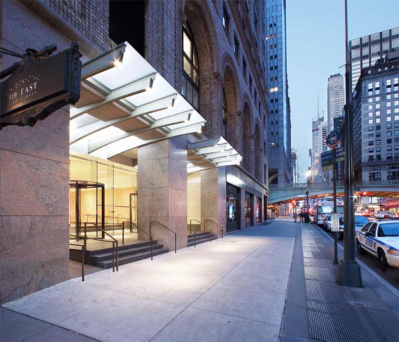
This week, we had the pleasure of speaking with Jeff Gertler of Gertler & Wente Architects in New York City. Gertler’s project at 125 Park Avenue in NYC, formerly known as the Pershing Square Building, offered a modern update to a lobby space originally designed in 1923 by York & Sawyer. With Grand Central Station as a neighbor, the redesign of 125 Park Avenue had to hold its own.
GPI Design: What did the lobby space mean to the building as a whole?
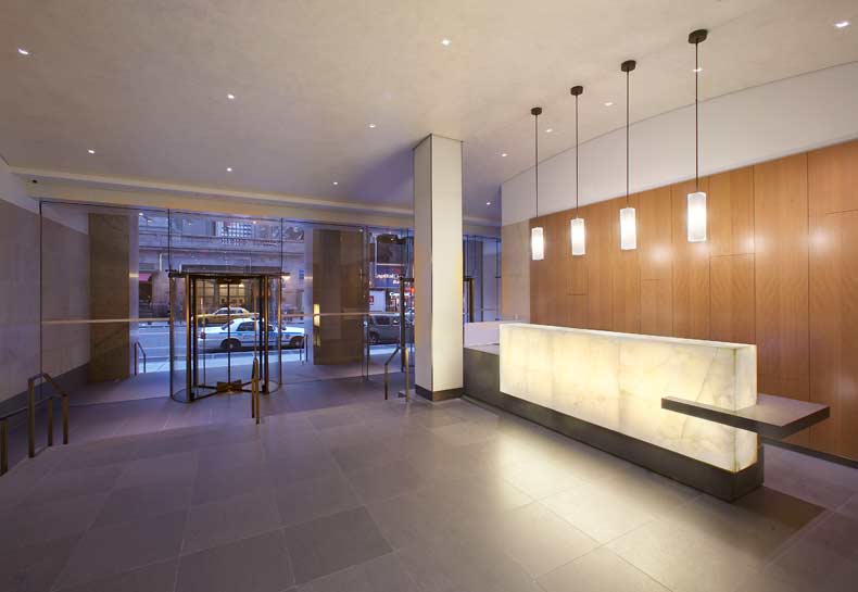
Jeff Gertler: It is a large lobby to a very old, very impressive, traditionally designed building opposite Grand Central Station. Shorenstein Realty, the owners wanted their new acquisition to have a presence in spite of its famous and architecturally noteworthy neighbor. So it was important that the building was able to stand on its own and draw attention from passersby. Creating a powerful street level face was incredibly important in opening up this space; the mullion-free glass and creative canopy draws people’s eyes to the front of the building. The canopy reflects the geometry of the nearby vehicular viaduct bridge over 42nd street.
GPI: What were your functional and conceptual goals for the lobby?
Gertler: We wanted to make sure people saw the entrance to the building, it was not apparent due to heavy metal framing that masked the actual entrance. We recessed the entrance, leading visitors first up a few stairs and then through the frameless glass doors into the interior, and then several more stairs to the main level. The entry sequence was important. To avoid an abrupt transition from 42nd street directly into the building, we created an “exterior lobby” using the sequencing of sidewalk, platforms, glass wall, and interior stairs. This made the entry movement more of an experience.
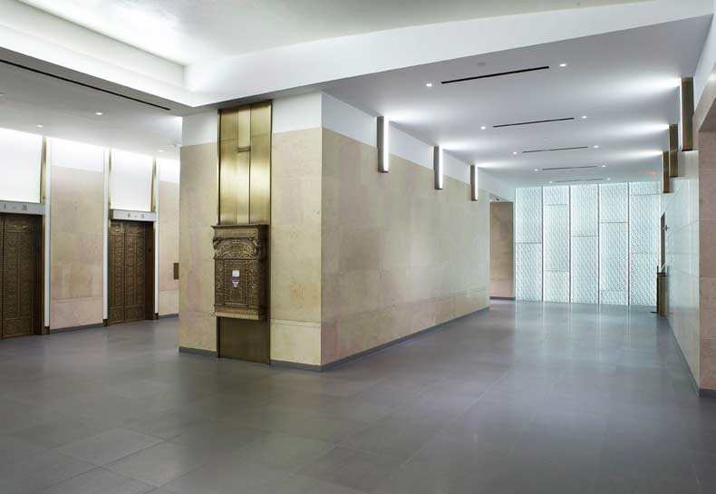
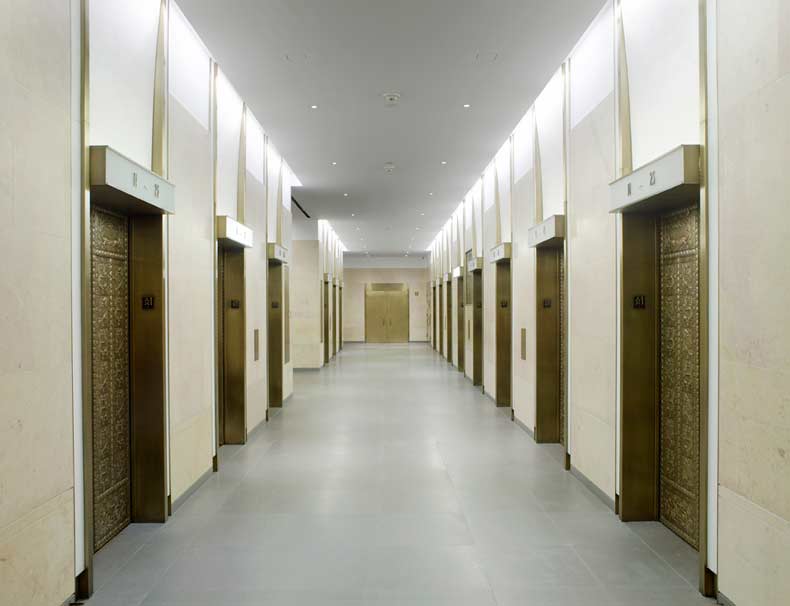
The lobby is nearly 175 deep and we created events along the way so it didn’t appear to be that long. At the end is a feature wall of 2”thick clear glass, by Bendheim, with “wrinkled” aluminum foil texture at the back of the glass, which is side lit, and causes the aluminum to glow in numerous and assorted directions. As you look through the lobby, you are pulled towards the back wall. This orients users towards the elevators which are situated about halfway between the front door and back wall.
GPI Design: How did you use specific design tools (such as color, form, materiality, lighting) to create the space?
Gertler: The reception desk area is marked with a backlit onyx with hanging white glass light fixtures and anigre wood wall paneling behind it. This reception area is a special space marking arrival to the building, discovered at the top of the second platform. We used volcanic stone, Basaltina, for the flooring; which is largely a cool grey but having enough movement through the stone that ties the entire lobby together. We salvaged the marble on the walls while cutting it back near the floor and ceiling and adding sheet rock.
The space at the elevator lobby is quite different than the other spaces. We salvaged all of the original cab door faces and frames while refacing the other wall surfaces. This provided a modern update while still reflecting the age of the building. How do you bridge between a modern interior that still relates to the original 1920s design? We didn’t want it to be totally abrupt, but didn’t want to do a full restoration of what was there. Salvaging the brass doors and updating the surrounding wall surfaces was our device for bridging the old and new architecture.
GPI Design: What was the biggest constraint in turning this design into a reality?
Gertler: Construction was difficult because it had to be sequenced. Having to maintain the lobby to be open and safe all the time, on a 24/7 basis, construction was done in stages. Therefore materials, geometries, and alignments couldn’t happen at one time, they had to fall in a sequential manner. Throughout the course of the job, this made it difficult to obtain perfect alignment over the length of a long lobby. Our team spent a significant amount of time on site managing the construction.
GPI Design: What makes this space impactful?
Gertler: A combination of three things makes this space impactful – the reworked geometry both in plan and section, the blend of materials, and the lighting beginning from the canopy and stretching to the back feature wall.
______
Many thanks to Jeff for sharing the design inspiration for this space. Stay tuned to our next Impactful Entry Space interview coming up in two weeks. For more visual inspiration, follow our Impactful Entry Space board on Pinterest.
In this Impactful Entry Space blog series, we will feature a designer or artist that has created an attention-grabbing design for the main lobby space of a building. Drawing inspiration from completed entry spaces around the world, we travel beyond the image by diving into the design process and concepts behind it.
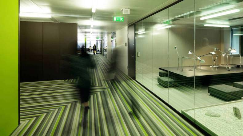
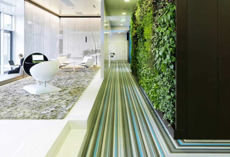
Today, we feature our interview with Martin Lesjak of Innocad about the lobby design of the Microsoft Headquarters in Vienna, Austria. Martin was recently named Designer of the Year by Contract Magazine.
GPI Design: What did the lobby space mean to the building as a whole?
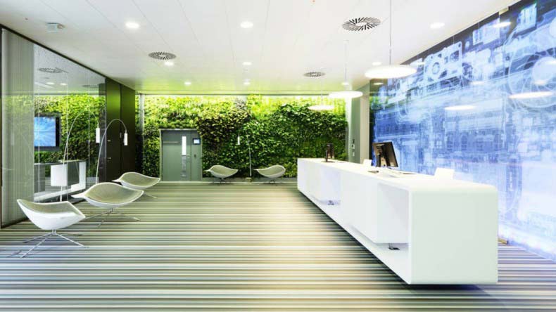
Martin Lesjak: The Lobby, as the first impression of a building, obviously is very important. In this project the goal was to create the working environment of the future, so this should be appreciable while entering the building.
GPI: What were your functional and conceptual goals for the lobby?
Lesjak: The functional concept was to give an inviting open impression, by avoiding a classic front desk. Therefore the welcome desk is turned 90 degrees, so it is no barrier. The conceptual idea was to create a concept between the high-tech backlit and the natural vertical garden in the back. The striped flooring transforms you to the new world of work.
GPI: How did you use specific design tools (such as color, form, materiality, lighting) to create the space?
Lesjak: As mentioned the main design tools are the characteristic flooring, the green wall and the graphics. We made an x-ray shoot of a Microsoft laptop that creates this unique aesthetic.
GPI: What was the biggest constraint in turning this design into a reality?
Lesjak: The biggest challenge was to convince the client and its employees of the totally open welcome desk layout, because there is nothing to hide behind.
GPI: What makes this space impactful?
Lesjak: I think most impactful is the interaction and the contrast of the three main elements: green wall, flooring and graphics.
______
Many thanks to Martin for sharing his inspiration for this lobby design. Stay tuned to our next Impactful Entry Space interview coming up in two weeks. For more visual inspiration, follow our Impactful Entry Space board on Pinterest.
If you believe in the popular misconception that wood and other natural materials give rooms a “rustic” feel, think again! In the modern age, designers are finding innovative ways to introduce natural wood to the hospitality world without sacrificing a sleek, upscale aesthetic. You’re sure to love these unique applications of a very traditional material. We can’t help but imagine how well these materials would pair with ambient backlighting!
BanQ Restaurant
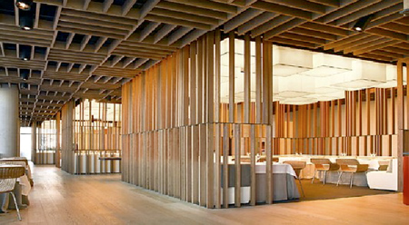
Office dA, a Boston-based architecture firm, had the challenge of creating a one-of-a-kind interior for BanQ, a French-inspired restaurant with a Southeast Asian twist. The architects utilized the beauty and flexibility of natural wood to balance the sophisticated atmosphere of a French establishment with the exotic flair of an Asian bistro. Opting to “radicalize the difference between the ground and sky,” the designers chose to make the ceiling the focal point of the space. The experimental project was created using a simple CNC milling device, which resulted in luxurious waves at an economical price. Light and shadow play an important role in the perception of the wave forms.
The Warung
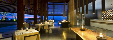
Perched on a cliff overlooking the ocean in Bali, some might say The Warung could put interior décor on the back-burner, allowing mother nature to become the primary design element. WoHA Architects made a compromise, and relied on natural wood to blend the interior and exterior environments while simultaneously recalling traditional Indonesian and Balinese building materials. While precise wood perforations in the upper level act as a daylight filter, white walls at eye level allow the tropical scenery to captivate diners.
Cotta Restaurant
SCDA Architects took advantage of the tropical Southwest Pacific climate in Cotta Restaurant, purposely blurring the boundaries between the dining room and the beach into one enormous space. Delicate pieces of overhead wood give the dining area a sense of enclosure, and local trees are repurposed as tables. By laminating the oversized wood tables, designers were able to achieve a sophisticated look that seamlessly integrates into the natural setting.
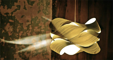
Link S Suspended Lamp
Rather than designing a site-specific light fixture, Lzf lamps has launched a line of handcrafted lights made exclusively out of natural wood. These exquisite lamps utilize the internal beauty of wood to radiate warm light throughout its surroundings, casting unique shadows on adjacent surfaces. With graceful curves and a variety of wood tones available, the Link S suspended lamp will continue to hang in upscale restaurants around the globe.
Bravo 24
Allowing the food of world-renowned chef, Carlos Abellán, to be the star of the restaurant, Isabel Lopez Vilata took a minimalist approach to the interior décor of Bravo 24 in Barcelona, Spain. By organizing simple lumber in an ornate geometrical pattern, the restaurant retains an open, modest appearance with a sophisticated flair. Plush seating and white linens gives an added warmth to the space, while also serving to counteract the hard surfaces of the walls, floors, and ceilings.
From rustic to chic, it’s clear that the wood carries endless design opportunities. As material technology advances and creativity abounds, we can’t wait to see what designers are going to try next!
Color is a powerful device, and it is everywhere! For centuries, color has been used to influence human behavior due to its ability to evoke emotion and trigger the senses. In recent years, however, the art of color psychology has not only given interior designers control over your perception of a space, but your mood while you occupy the space as well. Take a look at how top designers are creatively applying color to form beautiful spaces that are easy on the eyes…and easy on the mind!
Red: Passion
Bold, energizing, and spontaneous, it’s no surprise that the color red has a powerful impact on our senses, including our appetite! Designers around the world have incorporated red into contemporary restaurant décor to stimulate cravings, conversation, and atmosphere. Stack, a new-age American grill in Las Vegas, is not shy with the hue, using tinted lighting to apply red everywhere from floor to ceiling!
Orange: Energy
Did you ever think a color could help you up the intensity and duration of your workout? Immediately afflicting feels of enthusiasm, adventure, and self-confidence, designers have named orange the color of choice for active environments and recreation centers, like Miribilla Fitness Club in Spain. This lively hue not only instills energy for the body, but for the mind as well!
Yellow: Creativity
Balancing fun and logic, yellow is the perfect color to incorporate into creative offices. Surrounding yourself in this hue not only boosts intellectual powers in the creative side of the brain, but causes the mind to release serotonin, the “feel good” chemical. Designer Ana Hernández Palacios confidently applied yellow to the walls and ceiling Lexington Avenue Modeling Agency to give an added creative flair to the minds of both the photographers and models.
Green: Harmony
Occupying more space in the visible spectrum than any other color, Green has the ability to relax the body both mentally and physically. Because it’s the most soothing hue in the color spectrum, designers around the world are taking inspiration from nature to carry the shade into tranquil interior spaces, especially spas. Balancing natural stone, ambient light, and soft shades of moss green, the design of Dolder Grand Spa in Zurich provides the ideal backdrop to rejuvenate the mind and body.
Blue: Productivity
From water to sky, blue is perceived as a constant in daily life, and has gradually become the preferred color for workspaces around the world. Signifying responsibility, dependability, and wisdom, shades of blue allow people to focus on personal tasks without distraction. That doesn’t mean the blue offices have to be boring! Designers around the world have been captivated by the contemporary application of blue materials and lighting inside the new Google office in Sydney, Australia. It doesn’t hurt that this hue has overwhelmingly won “favorite color around the world” either!
Purple: Extravagance
Associated with wealth, opulence, and fantasy, purple has become the favored color among designers specializing in the nightlife and hospitality industry. Blending the confidence of red with the calming nature of blue, this hue never fails to make a bold statement in a sophisticated way. Posh night spots around the world, like Allure Nightclub in Abu Dhabi, are using purple on every surface from the seating to the lighting to grant every guest a feeling of royalty!
The next time you head to the gym, have a relaxing day at the spa, or try the new restaurant downtown, pay attention to the colors around you. Chances are, the reasoning behind their application goes far beyond beautiful decor!
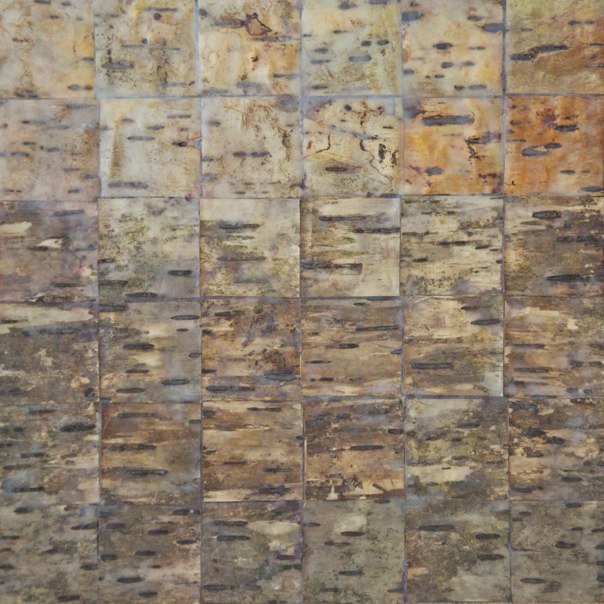
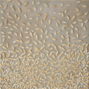
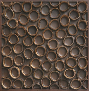
We’re thrilled to connect with Susie Frazier, Cleveland artist who engaged in sustainability even before it was cool. As the interview unfolds, you’ll quickly realize that Susie’s genuine passion for natural materials as early as childhood has sustained her impressive artistic life.
gpidesign: Do you have a personal design philosophy that unifies your artistic creations, or does each piece have it’s own inspiration and ideology?
Susie Frazier: Anything designed under my brand, whether it’s fine art, home furnishings, or fashion accessories, is born from three guiding principles: The work has to be resourceful, natural and down to earth.
It’s not enough to transform organic or industrial elements into something new. What matters to me is that I’m creating unpretentious objects that ultimately soothe the soul. Through simplified forms, muted earth tones, and organic patterns, my collection of art products evokes a sense of calm despite the chaos of life. And by embracing weathered, distressed textures, I’m defining a mindset that believes real beauty comes from the imperfections.
gpidesign: What inspired you to use nature as your artistic medium?
Frazier: The idea of designing with cast-off materials is something that’s been a family tradition since I was a child growing up in the American Southwest. There were times when my mother didn’t have a lot of means, so she taught us to be creative by salvaging what was readily available. For years, the only shelves in my bedroom were actually orange crates discarded from the local grocery store. Our living room coffee table was actually an old wooden gate mounted on four wood posts. Natural things like tree stumps, dried branches and pine cones were all on decoration rotation for decades.
Then, in 1997, I discovered the work of Andy Goldsworthy. I marveled at the mesmerizing patterns and forms he created in outdoor environments using nothing but raw materials he found on site. I remember thinking to myself how powerful that would be to create portable pieces with similar patterns but intended for interior environments. I thought if people could experience that beauty every day when they came home from work or school, maybe it would help them see the world in a different way. As I launched my career that same year, I realized just how comfortable I felt with the process of transforming discarded earth elements into something meaningful. It was like coming home. Of course, that was before the term “going green” was coined, so I had to do a lot of educating about organic matter as a viable medium.
gpidesign: Do you think the shift towards sustainability will influence other artists to explore the benefits of natural materials?
Frazier: I definitely think our culture’s embrace of a greener lifestyle over the past fifteen years has influenced other artists, particularly those who are younger and don’t know any other way of living. While social concern for the environment made its way into pop culture as early as the late 1960s, it’s encouraging to see today’s artists taking the movement even farther by developing work that’s truly sustainable in its construction vs. creating work that’s just conceptualizes or politicizes sustainability issues. At a certain point though, sustainable measures will stop being considered “special features” and will eventually become the standard by which all things in modern society are created. Until then, I’m glad to know my work has contributed, on some level, to a shift in thinking about the benefits of nature’s beauty.
gpidesign: Are the wood elements for your framed displays and sculptures personally collected, or received from an outside source?
Frazier: Most of the earth fragments found in my fine art are collected by me while I’m wandering the beaches and forests of Ohio and Pennsylvania. Occasionally, I order from an outside supplier if I learn about a new medium with which I’d like to experiment, but I’ve taken great care to prioritize the use of materials and production partners that are right in my back yard.
I’m fortunate enough to have found a master woodworker in Cleveland who still works in the original shop his father established 50 years ago. The beauty of doing business with him is not only the vast knowledge he’s developed around his craft, but his meticulous storage of wood scrap that’s been saved through the years. Whenever I need frames or fixtures built, he scours through his decades-old stash in order to make use of what’s already on hand. It’s totally satisfying to know we aren’t resorting to freshly-milled lumber when there’s so much that can be repurposed.
When it comes to my home decor products, I’ve taken a similar but different approach. Because Cleveland has such a rich history in manufacturing, there’s a fairly strong market here for industrial salvage. Thankfully, I’ve been able to tap into an active supply chain in which weathered wood and steel cutoffs are by-products of other activities, so they’re set aside and sold as scrap. By leveraging the skills of local welders and woodworkers, I’ve been able to produce my designs in higher quantities, so far, without facing the downsides of far-away fabrication.
gpidesign: What statement do you hope to make to other artists and designers about vernacular design using local materials?
Frazier: One point I hope my story conveys to other artists is that meaningful design doesn’t necessarily come from any formal training or a pulse on the latest trends. It comes from the hard work of defining our ideals, immersing ourselves in our environment, learning about materials that are in surplus around us, and adapting local expertise into our processes. Indigenous people have lived by theses principles of vernacular design for centuries with great success. On so many levels, society benefits when manufacturing and consumer choices are made inside the constraints of what’s available vs. what’s possible simply because we can.
gpidesign: Oftentimes, the process behind a design is almost as innovative as the design itself. Do you have an experimental stage in which you try different patterns of wood varieties before settling on a final arrangement?
Frazier: One of the more interesting aspects of my fine art is the use of an ancient medium, called encaustic painting, whose roots date back thousands of years. When natural beeswax, crystalized tree sap, and colored pigments are melted together, the resulting liquid can be applied in heated layers to create colorful, natural works of art. In my case, I position the textural fragments in patterns as the dominant elements and let the encaustic fill in around it. The result is a durable and archival means of adhering and sealing those specific earth patterns together forever.
gpidesign: Are your designs crafted for specific clients?
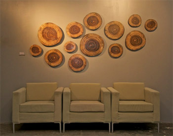
Frazier: Historically, I focused a lot of time on commission-based work for business-to-business clients like designers and architects. It’s definitely thrilling to see my work in public spaces and know people are positively affected by their exposure to it.
But, since I’ve launched several product lines through my online store and retail showroom in Cleveland’s Gordon Square Arts District, I find my attention turning more to consumer transactions and licensing options as a way to grow my brand. Ultimately, the various audiences attracted to my work all share one thing in common: a deep appreciation for the earth and a desire to find ways to connect to it.
You can visit Susie’s gallery showroom this Friday, June 15th between 5pm and 9 pm. If you stop by, leave a comment here letting us know which of her works piqued your interest and why!
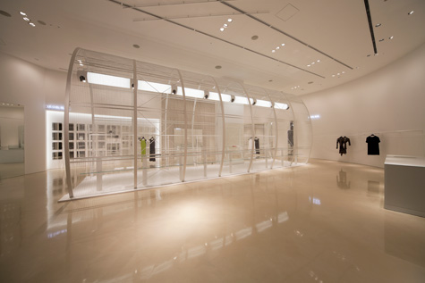
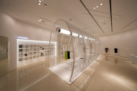
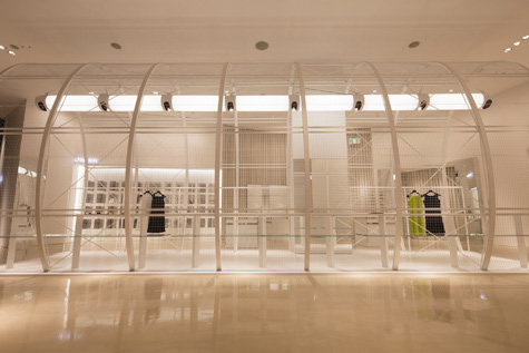
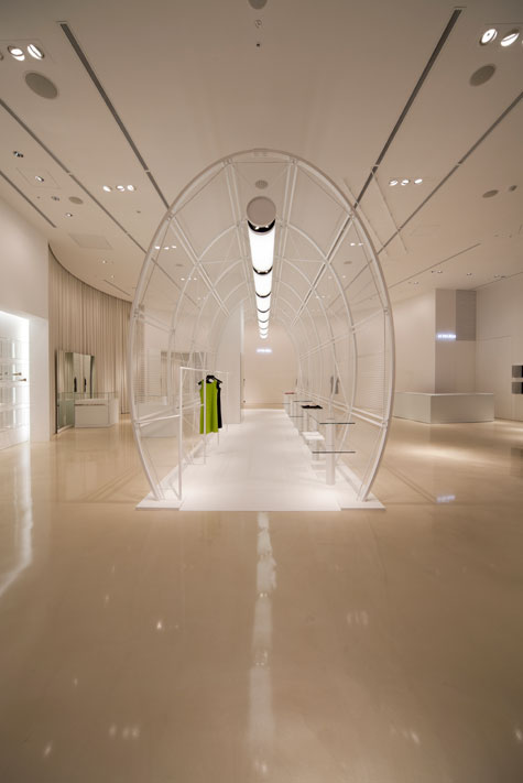
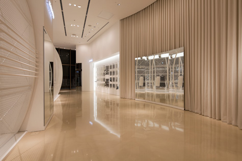
Japanese interior designer Noriyuki Otsuka describes his design for Le Ciel Bleu, a boutique retail space located in Osaka, Japan, as “a white space in brilliant colors”. The GPI team is excited to get in touch with Otsuka to learn more about his unique interpretation and approach to lighting design in this minimal retail environment.
gpidesign: In general, what does lighting mean to you as an interior designer?
Otsuka: Light is not able to show its own existence but when it is reflected off something, then its presence becomes known.
As an interior designer, I use this characteristic to design retail spaces.
gpidesign: How significant a role do you think lighting plays in defining a space such as Le Ciel Bleu?
Otsuka: This 278 square meter retail space has absolutely no wall dividers. Extends across the entire store from the windows. As a result, I got the idea to take the position, specs and color into consideration to create a certain impression with people who look into the shop from the windows.
I calculated the color temperature of the light in degrees Kelvin and arranged the lights so that the temperature of the light from the ceiling is 2800 K and the indirect lighting from the pendants in the cylinders (I call these ultra-pendants) and from the shoe area is 3200 K. Also, the neon lights installed inside the shop are 4200 K.
The differences in color temperature create shadows, and the design creates accents within the shop, which has few reflective materials.
gpidesign: The large pendant in the cylinder cage-like structure largely determines the theme of this space. What is your design inspiration of this pendant?
Otsuka: Light emitting diode (LED) lamps are currently the mainstream light source in the world of lighting design. LEDs have shorter wavelengths and the light that they omit is directional.
They are a wonderful product depending on the use. Nonetheless, the filament lamps invented by Thomas Alva Edison 130 years ago have excellent color rendering properties and are a complete light source with a broader light direction. They are able to make products look beautiful in boutiques that sell primarily garments, and they are an indispensable product. For this design, I created an analog light performance in a delicate cylinder that includes meanings of both tribute and cynicism.
gpidesign: Why did you choose the linear shape over other spotlight options?
Otsuka: This cylinder, which I call the birdcage, is made of the thinnest possible structural elements and the smallest possible amount of materials based on structural calculations.
Also, the form enveloped in a 30 mm by 30 mm steel mesh was designed using minimal color. This delicate birdcage takes in the light from the ultra-pendant designed as a lamp that emits light 360 degrees around from the steel mesh and serves as a symbol of this 278 square meter retail space.
gpidesign: What factors do you need to take into consideration to ensure sufficient light source in such a commercial space? And how do you cope with them?
Otsuka: The retail shop is located in a shopping mall with an attached pedestrian deck on the exterior. The lighting in the mall walkway is from 5000 K discharge lamps. The ambient light coming in from the windows has the effect of making the color temperature too white. In addition, sunlight (6500 K) that comes into shops from the pedestrian deck during the day gives the color temperature a blue cast. For a commercial space that is influenced by various color temperatures, I created a curtain that cannot be seen with the eye in the window area inside the store by raising the brightness by three times. By calculating the color temperature relationships between the objects, materials, and light in the space on the inside of the curtain, I create a kekkai in the Japanese spatial aesthetic and establish a kuukan where everyone looks beautiful.
A sincere thanks to Noriyuki Otsuka for sharing his insight. His design philosophy “nothing is everything / mixtures of transparency” forces a strict attention to detail and subtle manipulation of holistic environments. We admire the elegant boldness of Otsuka’s philosophy and his work.
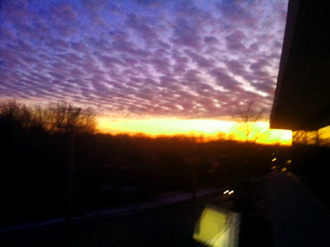
Maybe it’s time for more late night office sessions, the multitude of windows leads to endless inspiration! Playing with our backlit onyx samples late in the day, a quick glimpse out the window at the dramatic clouds reminds us why we love working with natural stone materials.
Evening view from the GPI Design Westlake office
Much like this sunset, the colors and patterning in natural stone are entirely organic and specific to a certain point in time. While the composition of the sunset is fleeting, the patterns formed in an onyx panel are stamped for eternity; a tangible piece of nature turned into a building material. Both the sunset and the onyx are gorgeous because of the components that constitute their forms and patterns, but lighting brings a whole new layer of warmth and dimension to their perception.
12″ x 20″ sample of backlit Iranian Blue Onyx
Admittedly, the thought of placing color gel filters over the windows to tint the sky to our exact liking DID cross our minds. (And what if that cloud moved left just a little bit? Ooh, I would love to see more gold just above the horizon.) We constantly remind ourselves to run with the randomness of nature. Sometimes you just can’t design beauty.