Impactful Entry Space: Edgecliff Medical Centre
In this Impactful Entry Space blog series, we will feature a designer or artist that has created an attention-grabbing design for the main lobby space of a building. Drawing inspiration from completed entry spaces around the world, we travel beyond the image by diving into the design process and concepts behind it.
Today, we feature our interview with Patrick Keane of Enter Projects about the lobby design of Edgecliff Medical Centre in Australia.

GPI Design: What did the lobby space mean to the building as a whole?
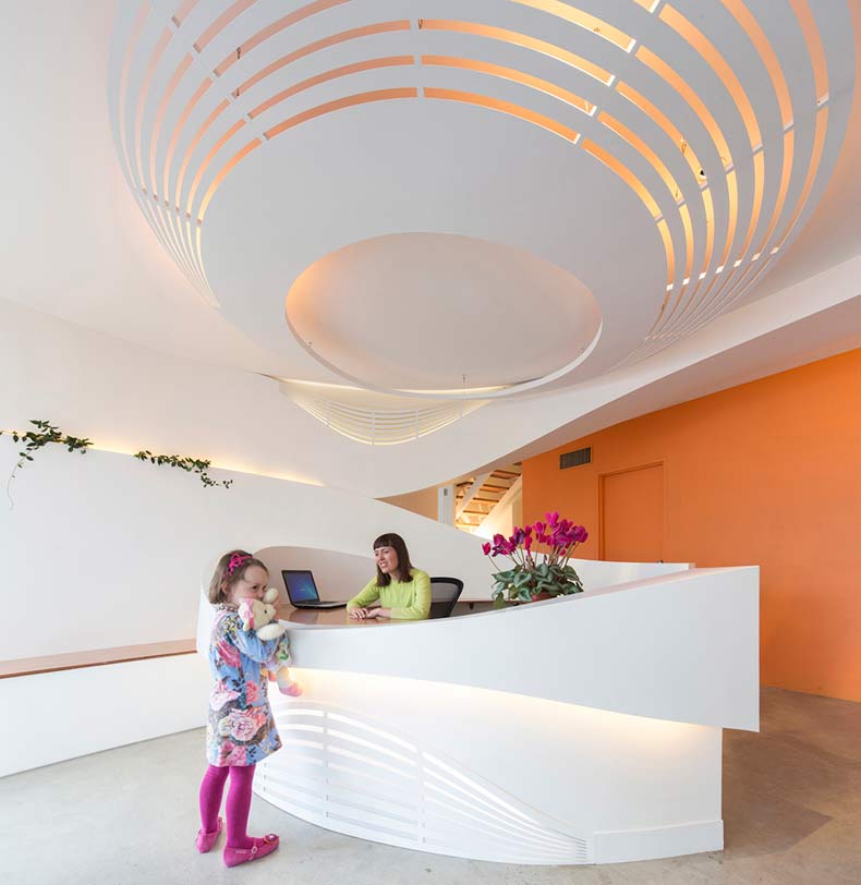
Patrick Keane: As Edgecliff Medical Centre is a centre for Autistic children, the lobby space was very important in providing a calming introduction to the space. The way in which the geometry circulates and unfolds promotes an atmosphere of calm, rest and relaxation for visiting patients as they enter the space, allowing them to feel welcome and safe within the building as they continue through to treatment rooms.

GPI: What were your function and conceptual goals for the lobby?
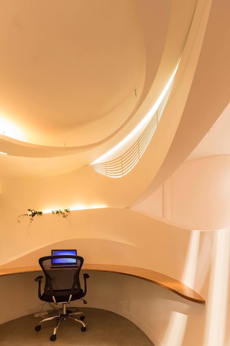
Keane: The concept was an exploration in infinite space, where walls, furniture and lighting blend into a three dimensional experience. Like digital architecture, all functions can blend into one moment without strict rules of vertical and horizontal. Layering and meandering of space provides a much more fulfilling journey, nobody is shuffled through the building. The lobby sets a clear example of digitally fabricated interiors, and acts as a prototype to see how these projects perform. In early conversations with the client, priorities were quickly realised: 3 radiating treatment rooms, a central reception area, lots of play spaces, soft furnishings like beanbags and excellent visibility – all of which contributed to the genesis for the ideas and space planning that followed. The curves, in severe circumstances, also prevent children from harming themselves on corners: where the function of this space is concerned, right angles are most definitely the wrong angles.

GPI: How did you use specific design tools (such as color, form, materiality, lighting) to create the space?
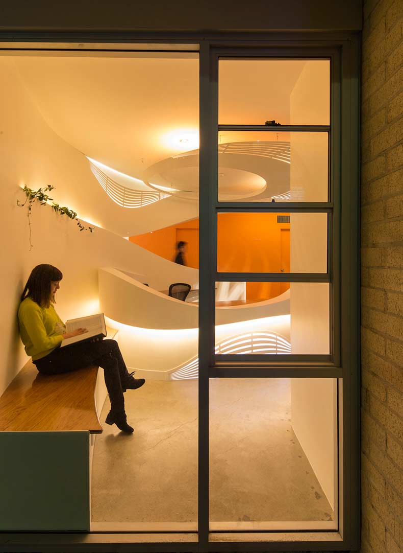
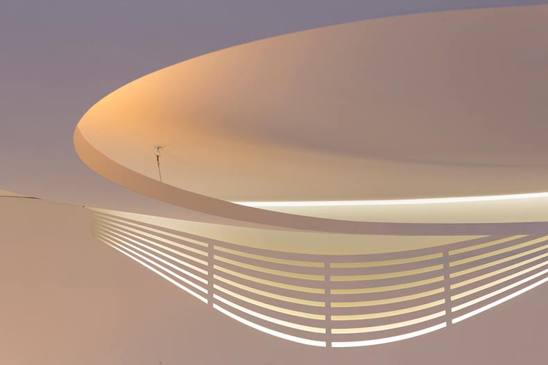
Keane: The partnership of light, optics & colour played a pivotal role in shaping the overall feel of the project. Indirect lighting was used to soften the space with cove lighting providing an additional calming effect. Colours play an important role in shaping our emotions and with this in mind, a fresh & neutral base pallet was chosen with bold colour injections interspersed throughout. Known for its healing properties, a fearless orange shade was chosen for the back feature wall. Soft furnishings complemented the colour scheme with playful Dinosaur design rugs and Fiocco “stocking” chairs by Busnelli.

GPI: What was the biggest constraint in turning this design into a reality?
Keane: Design sensitivity was imperative when considering the function of the space and very much influenced the final form. Having a clear understanding of the client’s needs on a day to day basis and moreover the needs of visiting patients, meant practical issues were also of high importance.
GPI: What makes this space impactful?
Keane: The flexibility and flow of the space. The indirect lighting and the way in which the versatile forms in the space transform from day to night.
______
Many thanks to Patrick for sharing his insight into the lobby design. Stay tuned to our next Impactful Entry Space interview coming up in two weeks. For more visual inspiration, follow our Impactful Entry Space board on Pinterest.
Image credits: Sucker Punch Daily
