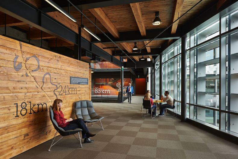
Impactful Entry Space: Federal Center South
In this Impactful Entry Space blog series, we will feature a designer or artist that has created an attention-grabbing design for the main lobby space of a building. Drawing inspiration from completed entry spaces around the world, we travel beyond the image by diving into the design process and concepts behind it.
Today, we feature our interview with Dan Simpson of ZGF Architects about the lobby design of the Federal Center South Building 1202 in Seattle, Washington.
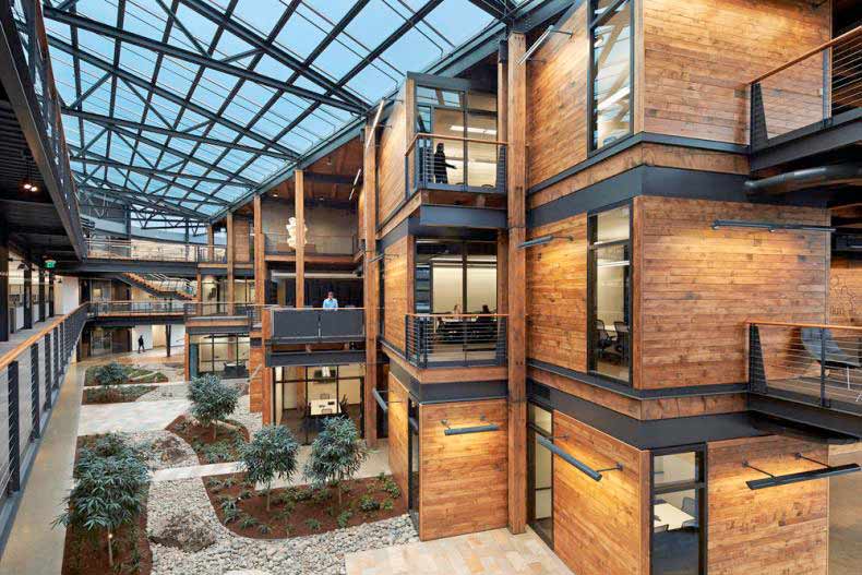
GPI Design: What did the lobby space mean to the building as a whole?
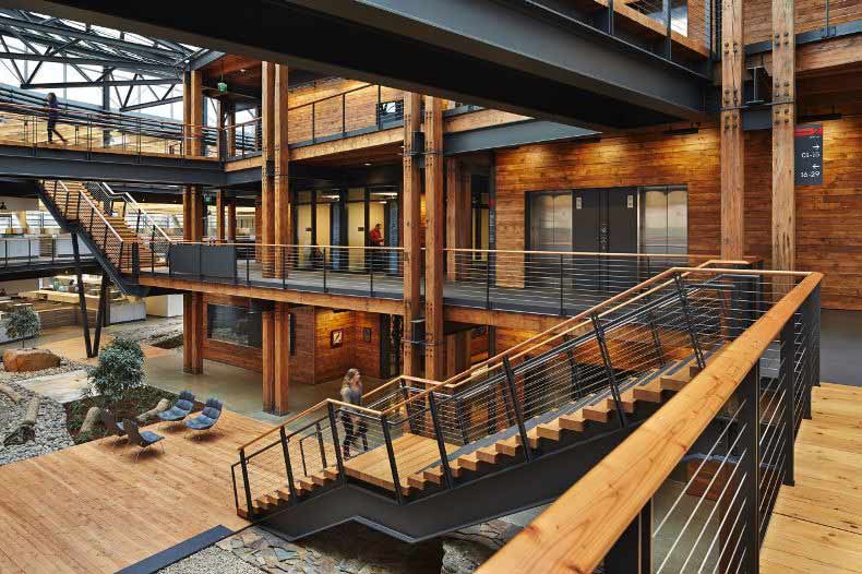
Dan Simpson: The entry lobby opens immediately into an open central “commons” which features an atrium, shared amenity spaces, and conference rooms designed for the U.S. Army Corps of Engineers (USACE). This common space is the heart of the building that unites the workplace and the people inside. The “commons” was designed to engage and unite more than 20 different departments within the USACE to foster community and enhance connection, communication and collaboration. We wanted all of the employees to overcome the “silo effect.”A significant driver was to minimize energy use and maximize productivity.
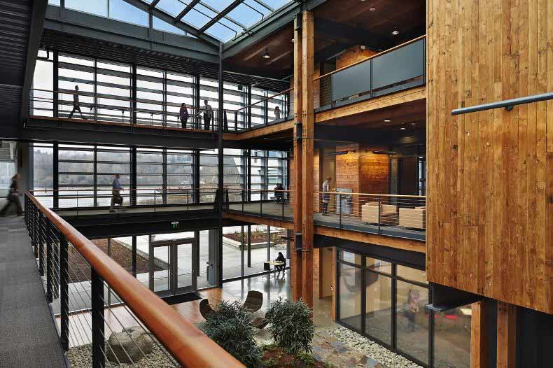
GPI: What were your function and conceptual goals for the lobby?
Simpson: Our goal for the central “commons” was to create a central gathering space and social hub that would attract and engage employees, unite the departments, and enhance collaboration. Another goal included leveraging strategies to minimize energy use and increase productivity within the design. The building as a whole achieved a very high energy use target of 25.7 KBtu/sf/year which puts it within the top 1% of energy-efficient office buildings in the U.S. One of the energy saving strategies used was to maximize daylighting in combination with narrow office wings and minimize the building perimeter by placing the “commons” in the center of the building. We were able to create an efficient envelope for the building and reuse timber salvaged on the site from the previously existing warehouse to support the building’s structure and create a unique expression in the lobby/commons.
GPI: How did you use specific design tools (such as colour, form, materiality, lighting) to create the space?
Simpson: This design-build project was designed using the latest industry tools, including Revit and BIM. “Authenticity of expression” drove the design. What you see is how it’s built. The oxbow as we call it, is a fully unified solution. USACE teams located in the office space surrounding the “commons” can grow and shrink infinitely. “Biophilia,” the instinctive bond between human beings and living systems, served as an important design driver, incorporating not just daylight, but a specific way of creating patterns to obtain shadow within the space that are similar to light coming in through trees in a dappled effect. This also includes incorporating salvaged wood and pairing it with actual living plant materials, to create a park-like setting in the “commons.” The structural timber columns have the natural effect of branching and joining. An integrated wayfinding and signage strategy showcases the work of the USACE and adds another natural element to the design.
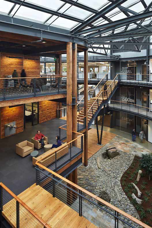
GPI: What was the biggest constraint in turning this design into a reality?
Simpson: The availability of the salvaged timber and other wood materials from the existing warehouse on the site was a great opportunity for reuse. This required the design team to collect, inventory, evaluate, and rate the integrity and strength of the timber, what could be used in the structural solution, and what could be repurposed for signature design elements such as benches and wayfinding and signage wall treatments. Due to the amount of salvaged timber available, the architects and structural engineers collaborated to create a unique structural composite of wood and concrete to maximize the impact of the timber in the space.
GPI: What makes this space impactful?
Simpson: The result is unexpected of a federal building. The design marries functionality and flexibility with an aesthetically pleasing solution. When you think of “impact” you think of the experience of a person in the space, so I believe that the impact factor of this project is enhanced by surprise and contrast. The contrast between the modern stainless steel exterior of the building and the rich wood interior with a natural setting. There is a strong contrast as you walk through the lobby and“commons” and experience a park first-hand within the industrial setting.
Ultimately, our design success lies in the eyes of the client, which is apparent through many positive remarks. Colonel Bruce Estok, Commander, U.S. Army Corps of Engineers, Seattle District, shared, “We now have the right physical space to maximize our contribution as the nation’s engineer. Throughout our history, innovation and sustainability have been Seattle District hallmarks. The flexibility, collaboration, and transparency of this building’s physical layout provide the ideal environment to build on that legacy.” Olton Swanson, Deputy District Engineer, U.S. Army Corps of Engineers, Seattle District, added “The building is fantastic. There is no comparison to this building and I tell folks that I spent 30 years trying to get to this environment and it was well worth the wait. This is an absolute phenomenal facility. What I like best about the building is the openness, and seeing people kind of on a professional level and a personal level. Spending time interacting, you don’t have to seek each other out. Just the act of walking from one office to another, you are interacting with lots of folks.”
______
Many thanks to Dan for sharing the design inspiration for this space. Stay tuned to our next Impactful Entry Space interview coming up in two weeks. For more visual inspiration, follow our Impactful Entry Space board on Pinterest.
Image credits: AIA Top Ten, Arch Daily, Christine Kipp, Benjamin Benschneider

