Impactful Entry Space: Four Seasons Hotel Toronto
In this Impactful Entry Space blog series, we will feature a designer or artist that has created an attention-grabbing design for the main lobby space of a building. Drawing inspiration from completed entry spaces around the world, we travel beyond the image by diving into the design process and concepts behind it.
Today, we feature our interview with Gary Thornton of Neo Light Design about the lobby design of the Four Seasons Hotel Toronto.
GPI Design: What did the lobby space mean to the building as a whole?
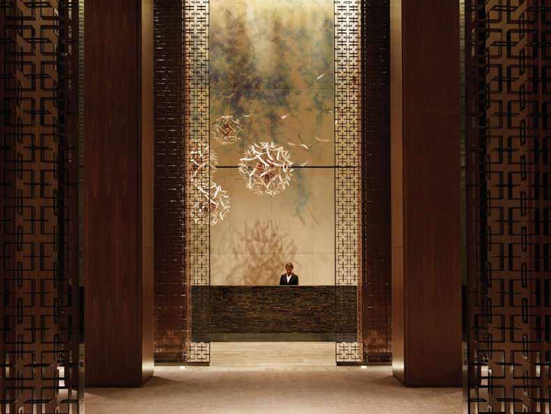
Gary Thornton: The Main Lobby’s impressive double height central space serves as a welcome entrance portal and space to the Flagship property for Four Seasons, as well as providing a physical link to adjacent areas. The central lobby feeds to the grand reception desk, waiting areas, and break out seating areas for relaxing near the bar. A central space providing a plethora of options for the guests.
GPI: What were your functional and conceptual goals for the lobby?
Thornton: The lighting was designed to complement both the architecture and the interior design, as well as the overall client vision. This included the expected standard of a Flagship property for the Four Seasons hotel group as the operator.
Simply put, it was to set the standards for luxury hotels in the city and the world.
Careful consideration was taken with the detailing to ensure that our lighting was incorporated into various elements of the architecture and interior design. Hidden light sources were heavily used so that you see the lit effect, and not the light fixtures themselves.
In a double volume height space maintenance of a busy hotel was always going to be difficult and inconvenient. LED and long life efficient light sources were used to ensure that this would be kept to a minimum over the coming years and would reduce any impact on the running of the hotel.
In particularly awkward spaces fibre optic light sources were utilised to provide the illumination at high level to reduce any potential maintenance issues here.
GPI: How did you use specific design tools (such as color, form, materiality, lighting) to create the space?
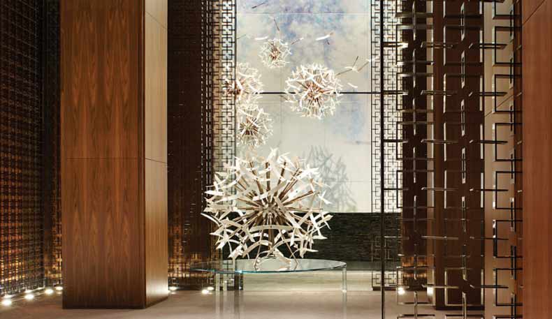
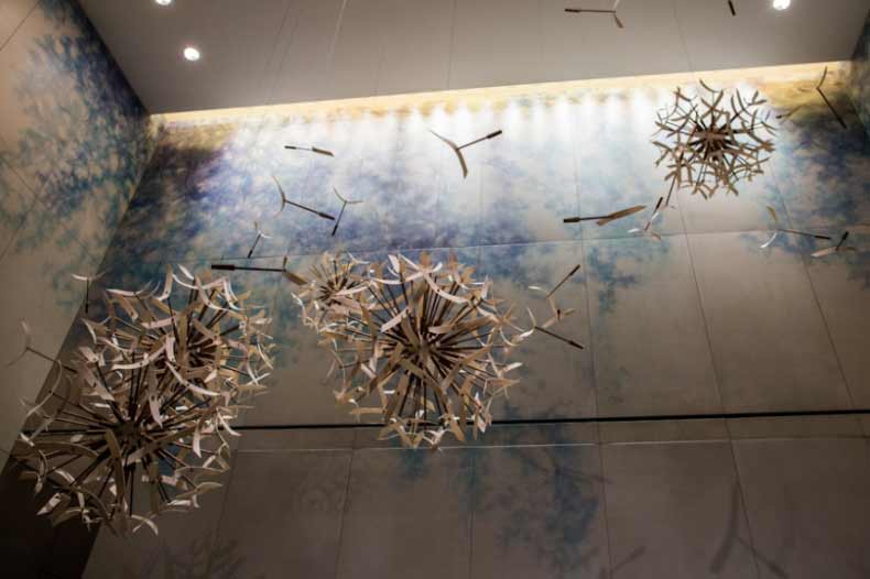
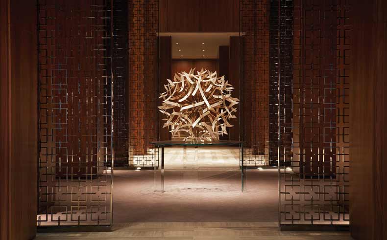
Thornton: Significant sculptural artworks suspended above the reception and within the centre of the space are carefully lit to bring them to life, highlighting their forms to create depth and interest in the large volume.
A warm white colour temperature was generally used throughout the lobby during the day, with the low voltage AR111 lamp sources warming slightly towards 2700K as they were dimmed on the control system for a more intimate feel during the evening and night.
Large metal screens that help form part of the hotel’s identity are made up of 50,000 individual pieces and lit with both in-ground uplights and downlights to add sparkle and drama.
The screens on the raised platforms that flank either side of the lobby space are lit using linear LED lights hidden within the form that shimmer as you walk through, helping to create the feeling of privacy to the seating areas below.
High efficiency cold cathode is concealed in coves to create an overall softness to the lighting with high output lamps on a timed scene set system being used to then focus on art and various other features within the space.
GPI: What was the biggest constraint in turning this design into a reality?
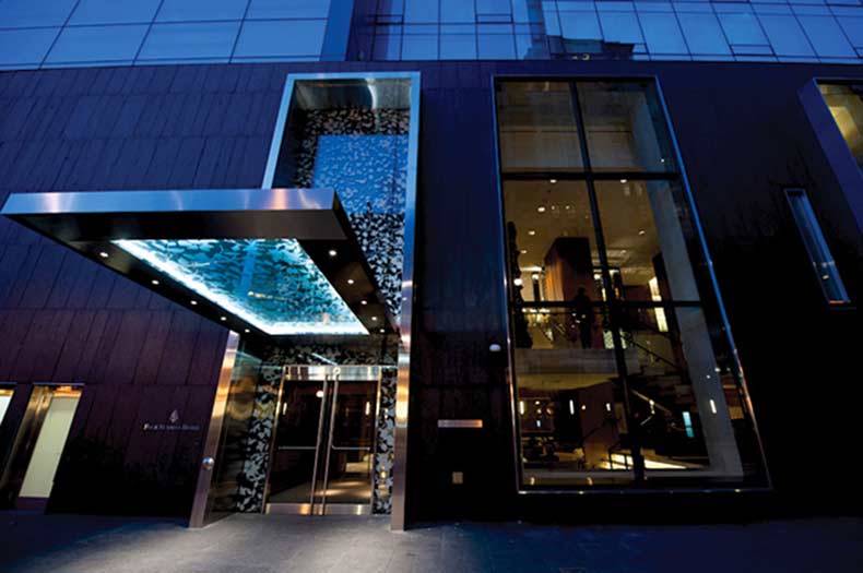
Thornton: One of the biggest hurdles was ensuring that we were compliant with all of the local codes and varying regulations that are present within Canada. There was a lot of initial concern over which regulations were the exact requirements to be followed, ranging from Canadian (national), through to Ontario (provincial), Toronto (city), or Yorkville (district). National codes set the minimum values for some aspects, whilst some others are superseded at district level.
With a limited budget for light fixtures that was further value-engineered, we worked extremely hard to ensure that we complied with all of the necessary documentation without comprising on the design.
Being able to meet and sign off all of these requirements was a huge milestone for us as the responsible consultant, and for Four Seasons to ensure that the hotel could open on time.
GPI: What makes this space impactful?
Thornton: The fact that it is just the first impression of the wider guest experience. The lobby serves a stunning welcome point, yet offers multiple functions subtly linked together. Carefully considered aspects of the interior design are brought to life with specially focussed lighting, and an automated scene set system ensures that the hotel looks as good as possible at all times. The lighting gradually shifts throughout the day from a bright and airy space to read a newspaper in the morning to a more intimate and ambient space to meet for drinks or dinner.
The lighting extends out from the lobby throughout the rest of the public areas and guestrooms in a similar manner, linking areas and bringing people on a journey through the hotel.
Overall the lighting is a subtle yet important element of the hotel and helps to create the feeling of stylish sophistication that the hotel delivers.
______
Many thanks to Gary for sharing the inspiration for this lobby design.. Stay tuned to our next Impactful Entry Space interview coming up in two weeks. For more visual inspiration, follow our Impactful Entry Space board on Pinterest.
Image credits: Jim Byers Travel, Yahoo, Neo Light Design
