Mock It Up So You Don’t Muck It Up
What is your favorite part of a project? Is it the concept phase where you’re spitting out wild ideas? Is it the more technical stage working through logistics and challenges? Maybe it’s the final steps of install where you see your vision in complete reality? For us at GPI design, the favorite part of a project is always a lively debate, but one thing we can all agree on here is the most IMPORTANT phase: the mock up.
Sometimes what you see in your head can be difficult to recreate, evidently, when it comes to illuminating translucent surfaces. Light and translucency can make even the most simplistic and straight forward designs difficult and unpredictable. Variables like brightness of the light, color temperature, and beam spread can further impact appearance, compound aesthetic and performance issues, and highlight unforeseen problems. Consequently, mock ups are so invaluable and critical to the success of any project, especially glowing statement features.
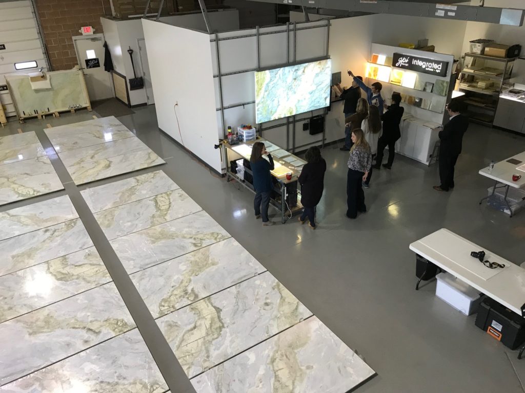
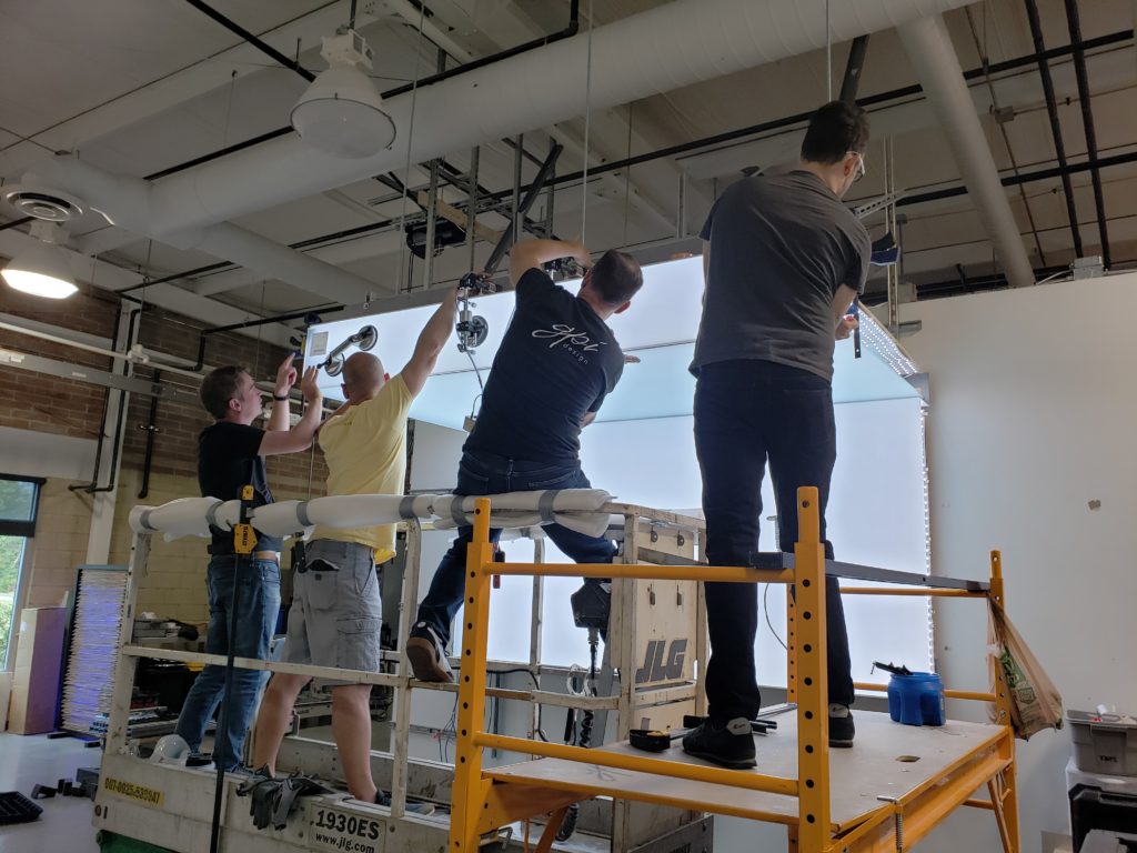
At GPI, the mock up is a standard part of our discovery practice. When we start a project, the mock ups are more informal at first, where we’re quickly trying to gather information or filter potential solutions. But simply putting a light fixture behind a small surface swatch will only tell you so much; you won’t get the full story or uncover all the potential pitfalls and challenges you might have to work around. So later, as we dig into the meat and potatoes of the feature’s design and have the nitty-gritty nuances well defined, we execute a full-size mock up that accurately portrays the surface, the lighting, and the structural system as intended for the final install. It is this full-size mock up stage that truly makes GPI unique.
But is a full-size mock up really THAT necessary you ask? Well, good question. Let’s get a little philosophical here for fun. If you were a chef, you would not create a new recipe and add it to your menu without mixing those specific ingredients, cooking the dish as you’ve outlined, and taste testing it first. That unique blend of ingredients could be the most delicious thing you’ve ever tasted! But what if it’s not? Taste testing it ahead of time allows you to make tweaks and adjustments to that recipe and bring it to perfection – a little most salt here, a little less cooking time there – before anyone orders it off your menu. Creating backlit systems works the same way. Even though we consider ourselves experts when it comes to translucent surfaces, we are constantly finding new ways to improve or enhance our strategies simply because of what we discover in our mock ups.
As much as our designers/engineers/installers/lighting techs use their knowledge, experience, and expertise to collaborate, theorize, sketch, and draw potential solutions, they are only “potential” solutions until we can craft that recipe and prove it works. Many times, we’re right on the money, with no adjustments needed. But sometimes we uncover unforeseen issues that weren’t apparent – and would never have been apparent – until the components were put together as they would be for the final install. This is huge, because it allows us to adjust and tweak the system to get things just right before the project ever goes into production or installation. Not only does that save valuable time and money, but maybe more importantly, it ensures the aesthetic and performance goals of the project are maintained.
There’s no big secret here, successful backlit features go hand in hand with creating successful backlit mock ups and tweaking and perfecting the system based on what those mock ups reveal. It’s not always the easiest or fastest approach to realizing a backlit feature, but it is key to obtaining a beautiful end result that not only is responsibly and thoughtfully designed, but one that also meets – or exceeds – your original vision.


