Impactful Entry Space: Vienna Microsoft Headquarters
In this Impactful Entry Space blog series, we will feature a designer or artist that has created an attention-grabbing design for the main lobby space of a building. Drawing inspiration from completed entry spaces around the world, we travel beyond the image by diving into the design process and concepts behind it.
Today, we feature our interview with Martin Lesjak of Innocad about the lobby design of the Microsoft Headquarters in Vienna, Austria. Martin was recently named Designer of the Year by Contract Magazine.

GPI Design: What did the lobby space mean to the building as a whole?
Martin Lesjak: The Lobby, as the first impression of a building, obviously is very important. In this project the goal was to create the working environment of the future, so this should be appreciable while entering the building.
GPI: What were your functional and conceptual goals for the lobby?
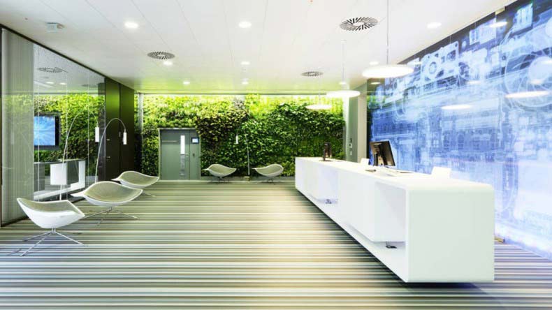
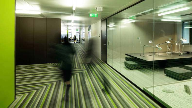
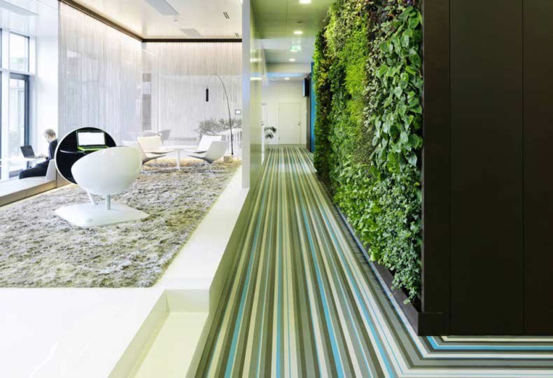
Lesjak: The functional concept was to give an inviting open impression, by avoiding a classic front desk. Therefore the welcome desk is turned 90 degrees, so it is no barrier. The conceptual idea was to create a concept between the high-tech backlit and the natural vertical garden in the back. The striped flooring transforms you to the new world of work.

GPI: How did you use specific design tools (such as color, form, materiality, lighting) to create the space?
Lesjak: As mentioned the main design tools are the characteristic flooring, the green wall and the graphics. We made an x-ray shoot of a Microsoft laptop that creates this unique aesthetic.

GPI: What was the biggest constraint in turning this design into a reality?
Lesjak: The biggest challenge was to convince the client and its employees of the totally open welcome desk layout, because there is nothing to hide behind.

GPI: What makes this space impactful?
Lesjak: I think most impactful is the interaction and the contrast of the three main elements: green wall, flooring and graphics.
______
Many thanks to Martin for sharing his inspiration for this lobby design. Stay tuned to our next Impactful Entry Space interview coming up in two weeks. For more visual inspiration, follow our Impactful Entry Space board on Pinterest.
Image 1, 2, 4: Paul Ott ©
Image 3: Christian Dusek ©
