A White Space in Brilliant Colors: Interview with Interior Designer Noriyuki Otsuka
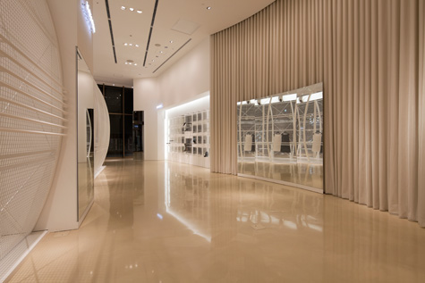
Japanese interior designer Noriyuki Otsuka describes his design for Le Ciel Bleu, a boutique retail space located in Osaka, Japan, as “a white space in brilliant colors”. The GPI team is excited to get in touch with Otsuka to learn more about his unique interpretation and approach to lighting design in this minimal retail environment.
gpidesign: In general, what does lighting mean to you as an interior designer?
Otsuka: Light is not able to show its own existence but when it is reflected off something, then its presence becomes known.
As an interior designer, I use this characteristic to design retail spaces.
gpidesign: How significant a role do you think lighting plays in defining a space such as Le Ciel Bleu?
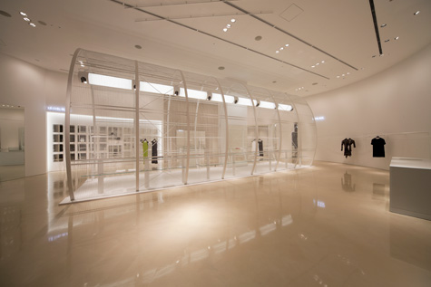
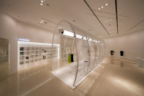
Otsuka: This 278 square meter retail space has absolutely no wall dividers. Extends across the entire store from the windows. As a result, I got the idea to take the position, specs and color into consideration to create a certain impression with people who look into the shop from the windows.
I calculated the color temperature of the light in degrees Kelvin and arranged the lights so that the temperature of the light from the ceiling is 2800 K and the indirect lighting from the pendants in the cylinders (I call these ultra-pendants) and from the shoe area is 3200 K. Also, the neon lights installed inside the shop are 4200 K.
The differences in color temperature create shadows, and the design creates accents within the shop, which has few reflective materials.
gpidesign: The large pendant in the cylinder cage-like structure largely determines the theme of this space. What is your design inspiration of this pendant?
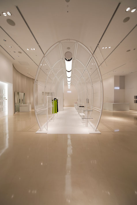
Otsuka: Light emitting diode (LED) lamps are currently the mainstream light source in the world of lighting design. LEDs have shorter wavelengths and the light that they omit is directional.
They are a wonderful product depending on the use. Nonetheless, the filament lamps invented by Thomas Alva Edison 130 years ago have excellent color rendering properties and are a complete light source with a broader light direction. They are able to make products look beautiful in boutiques that sell primarily garments, and they are an indispensable product. For this design, I created an analog light performance in a delicate cylinder that includes meanings of both tribute and cynicism.
gpidesign: Why did you choose the linear shape over other spotlight options?
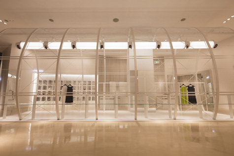
Otsuka: This cylinder, which I call the birdcage, is made of the thinnest possible structural elements and the smallest possible amount of materials based on structural calculations.
Also, the form enveloped in a 30 mm by 30 mm steel mesh was designed using minimal color. This delicate birdcage takes in the light from the ultra-pendant designed as a lamp that emits light 360 degrees around from the steel mesh and serves as a symbol of this 278 square meter retail space.
gpidesign: What factors do you need to take into consideration to ensure sufficient light source in such a commercial space? And how do you cope with them?
Otsuka: The retail shop is located in a shopping mall with an attached pedestrian deck on the exterior. The lighting in the mall walkway is from 5000 K discharge lamps. The ambient light coming in from the windows has the effect of making the color temperature too white. In addition, sunlight (6500 K) that comes into shops from the pedestrian deck during the day gives the color temperature a blue cast. For a commercial space that is influenced by various color temperatures, I created a curtain that cannot be seen with the eye in the window area inside the store by raising the brightness by three times. By calculating the color temperature relationships between the objects, materials, and light in the space on the inside of the curtain, I create a kekkai in the Japanese spatial aesthetic and establish a kuukan where everyone looks beautiful.
A sincere thanks to Noriyuki Otsuka for sharing his insight. His design philosophy “nothing is everything / mixtures of transparency” forces a strict attention to detail and subtle manipulation of holistic environments. We admire the elegant boldness of Otsuka’s philosophy and his work.
Image Credit: Noriyuki Otsuka
