Impactful Entry Space: Four Seasons Beijing
In this Impactful Entry Space blog series, we will feature a designer or artist that has created an attention-grabbing design for the main lobby space of a building. Drawing inspiration from completed entry spaces around the world, we travel beyond the image by diving into the design process and concepts behind it.
Today, we feature our interview with Anne Chan of Hirsch Bedner Associates (HBA) about the lobby design of the Four Seasons Hotel in Beijing.

GPI Design: What did the lobby space mean to the building as a whole?
Anne Chan: The lobby space in Four Seasons Beijing is meant for understated luxury, yet with a grand high ceiling tailor-made for a special sense of arrival. The design of the lobby is intended to give the special guests a warm greeting to Beijing. As guests enter the lobby further they enter into the heart of the building – the lobby lounge – the room opens up to a two story space and further enhances the grandeur from Ancient Chinese architecture of a courtyard space.

GPI: What were your functional and conceptual goals for the lobby?
Chan: The building and interior was designed to have no wasted space and each space naturally flows into the next. This lets the guest travel fluidly through the hotel. It is like visiting an ancient private Chinese mansion where different actions take place in different areas – giving it a more residential feel.

GPI: How did you use specific design tools (such as color, form, materiality, lighting) to create the space?
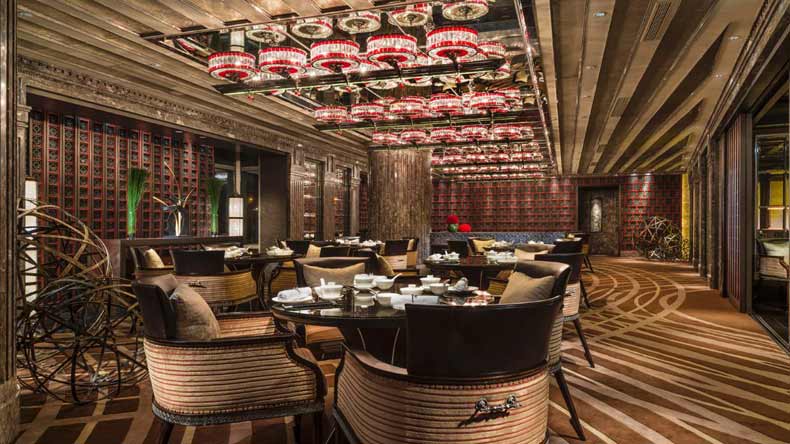
Chan: To achieve a high luxury and warm residential feeling to the space, a custom two story installation was designed filled with small metal pin objects inspired by traditional Chinese landscape painting. The interior and furniture materials are warm, vibrant, and energizing with ceiling panels in Imperial gold-leaf. The space features hand-crafted carpet with abstract dragon motif to bring good fortune. Fabrics are rich in texture including mohair, silks, leather with colors of gold, rust, grey, and blues. Walls and structural columns are clad in creamy white, onyx, polished chrome metal, and high-gloss black Zebrano wood.
GPI: What was the biggest constraint in turning this design into a reality?
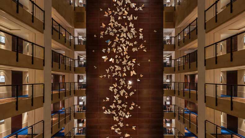
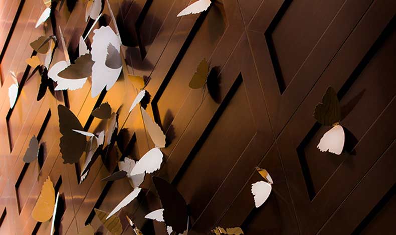
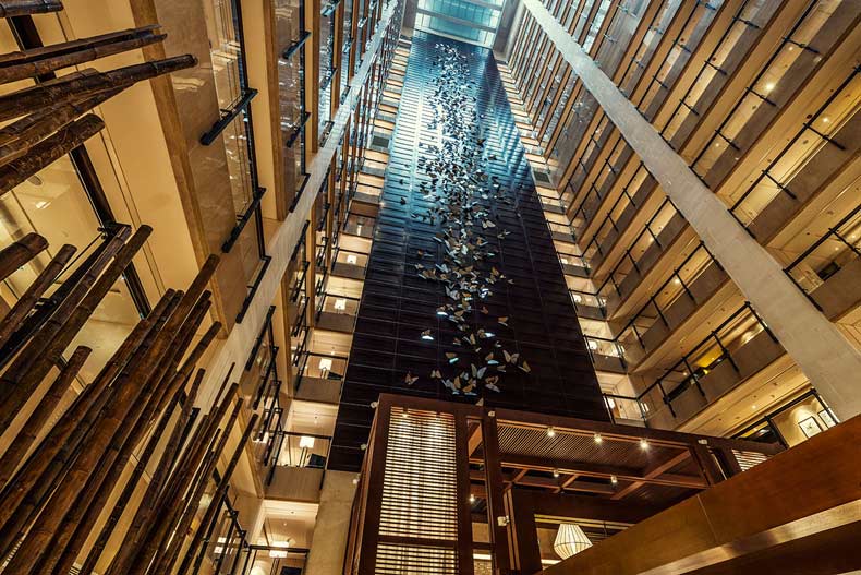
Chan: Some design challenges included a huge atrium that we needed to continue the aforementioned warm, cozy feel of the other spaces. Here we included a bamboo motif to the carpeting with a touch of modern Chinese artwork along the corridor, a touch of Chinese lattice subtly engraved on wall panels, and the grand atrium wall adorned with 2D metal butterfly objects giving a sense of movement and flow through the space.

GPI: What makes this space impactful?
Chan: Each space was designed specifically for its purpose. We wanted the guest to be surprised by traveling from one space to another and try to impact the guest’s experience by letting them spiritually enjoy the interior of the hotel.
______
Many thanks to Anne for sharing her design inspiration. Stay tuned to our next Impactful Entry Space interview coming up in two weeks. For more visual inspiration, follow our Impactful Entry Space board on Pinterest.
Image credits: Four Seasons Beijing, Ken Street
