Impactful Entry Space: 125 Park Ave
In this Impactful Entry Space blog series, we will feature a designer or artist that has created an attention-grabbing design for the main lobby space of a building. Drawing inspiration from completed entry spaces around the world, we travel beyond the image by diving into the design process and concepts behind it.
This week, we had the pleasure of speaking with Jeff Gertler of Gertler & Wente Architects in New York City. Gertler’s project at 125 Park Avenue in NYC, formerly known as the Pershing Square Building, offered a modern update to a lobby space originally designed in 1923 by York & Sawyer. With Grand Central Station as a neighbor, the redesign of 125 Park Avenue had to hold its own.

GPI Design: What did the lobby space mean to the building as a whole?
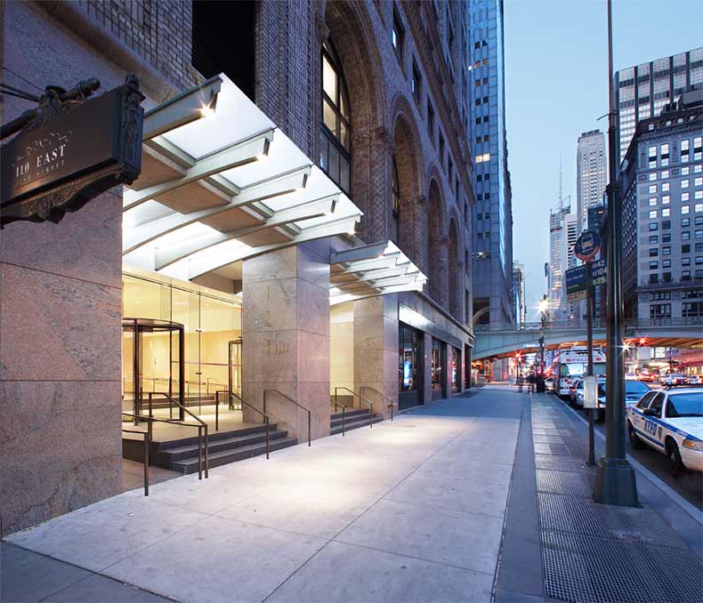
Jeff Gertler: It is a large lobby to a very old, very impressive, traditionally designed building opposite Grand Central Station. Shorenstein Realty, the owners wanted their new acquisition to have a presence in spite of its famous and architecturally noteworthy neighbor. So it was important that the building was able to stand on its own and draw attention from passersby. Creating a powerful street level face was incredibly important in opening up this space; the mullion-free glass and creative canopy draws people’s eyes to the front of the building. The canopy reflects the geometry of the nearby vehicular viaduct bridge over 42nd street.

GPI: What were your functional and conceptual goals for the lobby?
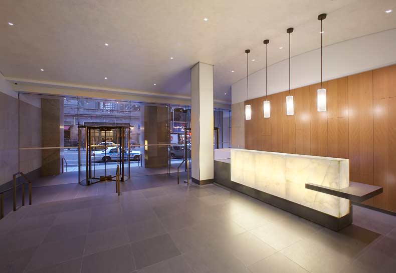
Gertler: We wanted to make sure people saw the entrance to the building, it was not apparent due to heavy metal framing that masked the actual entrance. We recessed the entrance, leading visitors first up a few stairs and then through the frameless glass doors into the interior, and then several more stairs to the main level. The entry sequence was important. To avoid an abrupt transition from 42nd street directly into the building, we created an “exterior lobby” using the sequencing of sidewalk, platforms, glass wall, and interior stairs. This made the entry movement more of an experience.
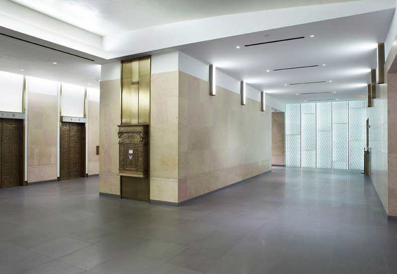
The lobby is nearly 175 deep and we created events along the way so it didn’t appear to be that long. At the end is a feature wall of 2”thick clear glass, by Bendheim, with “wrinkled” aluminum foil texture at the back of the glass, which is side lit, and causes the aluminum to glow in numerous and assorted directions. As you look through the lobby, you are pulled towards the back wall. This orients users towards the elevators which are situated about halfway between the front door and back wall.

GPI Design: How did you use specific design tools (such as color, form, materiality, lighting) to create the space?
Gertler: The reception desk area is marked with a backlit onyx with hanging white glass light fixtures and anigre wood wall paneling behind it. This reception area is a special space marking arrival to the building, discovered at the top of the second platform. We used volcanic stone, Basaltina, for the flooring; which is largely a cool grey but having enough movement through the stone that ties the entire lobby together. We salvaged the marble on the walls while cutting it back near the floor and ceiling and adding sheet rock.
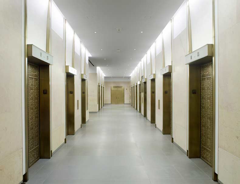
The space at the elevator lobby is quite different than the other spaces. We salvaged all of the original cab door faces and frames while refacing the other wall surfaces. This provided a modern update while still reflecting the age of the building. How do you bridge between a modern interior that still relates to the original 1920s design? We didn’t want it to be totally abrupt, but didn’t want to do a full restoration of what was there. Salvaging the brass doors and updating the surrounding wall surfaces was our device for bridging the old and new architecture.
GPI Design: What was the biggest constraint in turning this design into a reality?
Gertler: Construction was difficult because it had to be sequenced. Having to maintain the lobby to be open and safe all the time, on a 24/7 basis, construction was done in stages. Therefore materials, geometries, and alignments couldn’t happen at one time, they had to fall in a sequential manner. Throughout the course of the job, this made it difficult to obtain perfect alignment over the length of a long lobby. Our team spent a significant amount of time on site managing the construction.

GPI Design: What makes this space impactful?
Gertler: A combination of three things makes this space impactful – the reworked geometry both in plan and section, the blend of materials, and the lighting beginning from the canopy and stretching to the back feature wall.
______
Many thanks to Jeff for sharing the design inspiration for this space. Stay tuned to our next Impactful Entry Space interview coming up in two weeks. For more visual inspiration, follow our Impactful Entry Space board on Pinterest.
Image credits: Gertler & Wente
