Impactful Entry Space: Stamps.com Office
In this Impactful Entry Space blog series, we will feature a designer or artist that has created an attention-grabbing design for the main lobby space of a building. Drawing inspiration from completed entry spaces around the world, we travel beyond the image by diving into the design process and concepts behind it.
Today, we feature our interview with Sarah Walker of Ware Malcomb about the lobby design of Stamps.com offices in Segundo, California.

GPI Design: What did the lobby space mean to the building as a whole?
Sarah Walker: Our client, Stamps.com, was faced with a challenge while transforming their existing lobby into a new space to reflect their modern, creative brand while still maintaining a professional atmosphere to cater to guests and potential consumers that would walk through their doors. They needed to be sure the lobby design would attract, nurture, and retain the talent that serves as their company’s innovative foundation. Simultaneously, the building lobby needed to cater to guests and prospective consumers, and would serve as the first impressive of Stamps.com.
As a visitor, the lobby acts as a portal. It immediately announces your arrival into Stamps.com’s culture and brand. With the lobby connecting the two buildings, it also serves as an intersection for employees to connect and collaborate. In order to meet the shifting demands of the workplace, improved building amenities were a must. The lobby was home to the conference center and a large canteen that provided a snack service, pool table and a large, two-story water feature.
GPI: What were your functional and conceptual goals for the lobby?
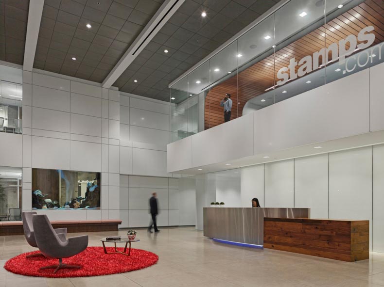
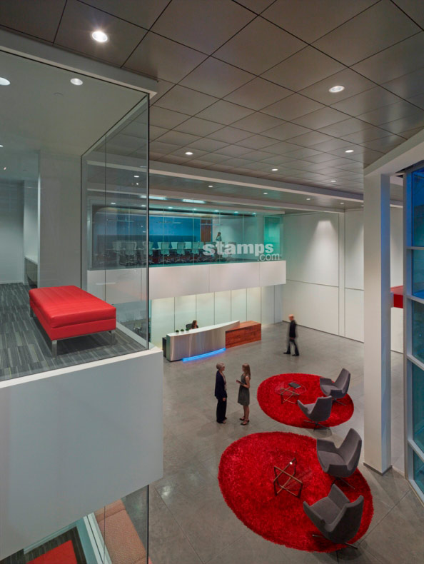
Walker: The goal was to move away from the traditional lobby into more of a foyer or interactive type setting. The end goal was to create a space that was an extension of the office, but still maintaining the primary function of receiving guests. The solution was a spacious, large volume, high energy, active environment with a splash of branding color to mirror Stamps.com’s culture and brand.
The functional goals were based upon sustaining and complementing the everyday operation of the organization. The lobby was divided into two separate zones – employee vs. secured public. The primary entrance to the building was open to the public, which was secured from the rest of the office. The employees would enter the lobby through the full service canteen, only accessible by a card reader.

GPI: How did you use specific design tools (such as color, form, materiality, lighting) to create the space?
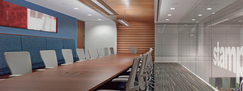
Walker: Layering of planes and cantilevered masses were used to accentuate the 2-story volume. These cantilevered elements were a home to the new Stamps.com conference rooms. Each conference room was branded a different color and labeled an adjective that related back to the color. For example, the “Tree House” conference room was emerald green.
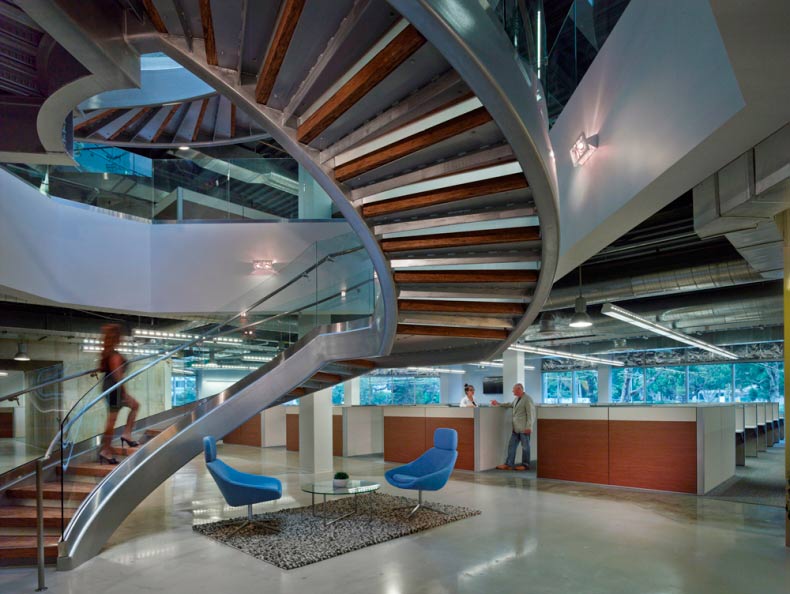
A deep dive was taken into the material selection. It was understood that the selection would play a vast role in increased productivity and effectiveness of their employees, yet still tying back to their values – raw, but polished, creative office. Glass with stainless steel accents, polished concrete, and reclaimed wood relate to the Stamps.com brand while enhancing the human experience.
All lighting was intentionally integrated within the architecture to enhance the experience. Some fixtures were programmed to be blue or red to connect the lobby to the office space.

GPI: What was the biggest constraint in turning this design into a reality?
Walker: With the lobby being a new building that connected the two existing buildings, working with existing structure and square footage limitations was a huge constraint. It took close collaboration with the structural engineers and the design team to meet the client’s expectations, yet also be constructible. Working with a challenging existing site to create a clean rational building lobby footprint was very difficult.
Security was also a primary design constraint. The main entrance needed to be secure from the public but allow for fluidity and easy access to the employees. To solve this circulation issue but allow for transparency, a large glass box stair was added which also provided a creative architectural statement to the exterior of the building.

GPI: What makes this space impactful?
Walker: The 2-story volume allows the visitor to feel the grandness of the lobby space as soon as they walk in. The meaning behind the cantilevered conference room overlooking the lobby was to induce a spiritual connection between work and colleagues. This conference room mirrors openness by being a glass structure but also serves as a platform for increased collaboration and effectiveness.
______
Many thanks to Sarah for sharing the design inspiration for this space. Stay tuned to our next Impactful Entry Space interview coming up in two weeks. For more visual inspiration, follow our Impactful Entry Space board on Pinterest.
Image credits: Ware Malcomb
