Impactful Entry Space: Hotel Alfonso XIII
In this Impactful Entry Space blog series, we will feature a designer or artist that has created an attention-grabbing design for the main lobby space of a building. Drawing inspiration from completed entry spaces around the world, we travel beyond the image by diving into the design process and concepts behind it.
Today, we feature our interview with Inge Moore, Principal and Creative Director of The Gallery HBA, London (Hirsch Bedner Associates) about the lobby design of Hotel Alfonso XIII in Sevilla, Spain.

GPI Design: What did the lobby space of Hotel Alfonso Xlll mean to the building as a whole?
Inge Moore: It is no exaggeration to say that Hotel Alfonso Xlll is one of the most prized landmark buildings in all of Spain. Located in Seville, the capital of the Andalusian region, it speaks of the layered cultural inheritance of this part of Spain, from the Moorish influence of the Arabs who once ruled there to its legacy as the cradle of bullfighting and the flamenco dance. The hotel itself was conceived by King Alfonso Xlll and opened in 1929, the stage for fabulous social gatherings and an essential stopover for travellers during the “Golden Age of Travel”. Today, the hotel is owned by the municipality of Seville and is deeply valued by many local people as an expression of Andalusian identity.
The lobby needed to convey all of this and it also needed to say “welcome” to a building that is a living, luxury hotel in the 21st Century. It is in the lobby that guests first touch the soul of the hotel and it is here that they need to be seduced with promises of what is to come in the rest of the hotel.

GPI: What were your functional and conceptual goals for the lobby?
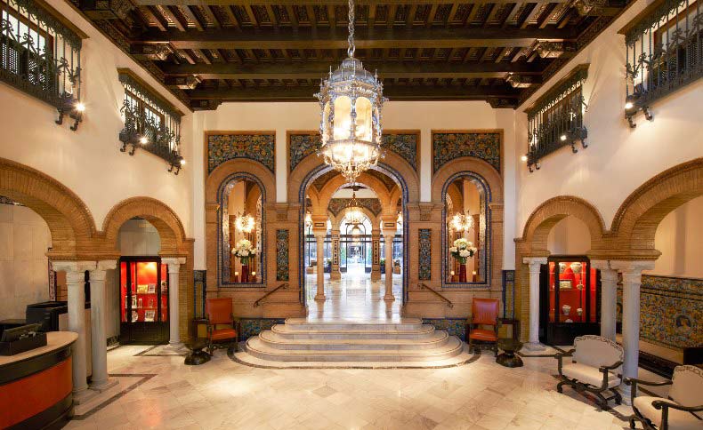
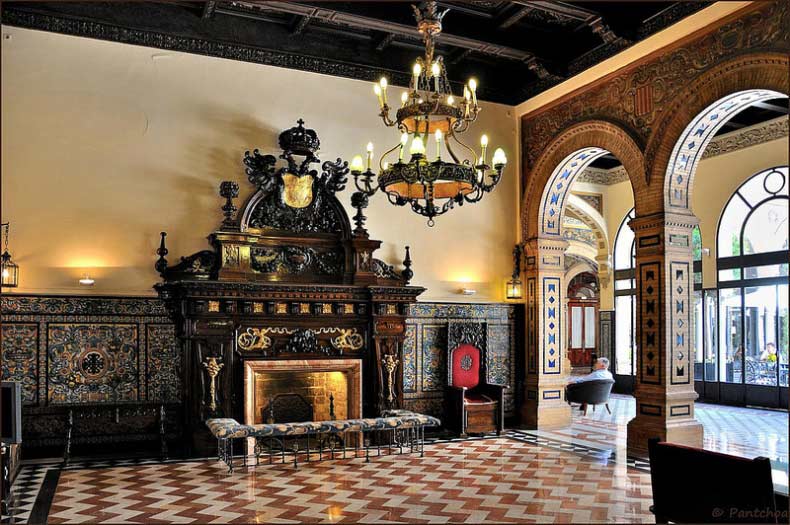
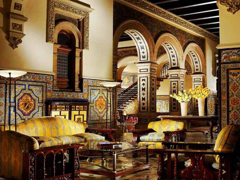
Moore: The interior architecture of the lobby was protected and we were absolutely forbidden to touch it – even if we had wanted to. So, ours was a very light touch indeed, leaving the intricately marbled floors, azulejos-adorned walls, bas-relief mouldings, lavish frescoes and architectural forms to be the star while carefully adding new loose furniture and fittings which we chose in tones extracted from the colours of the azulejos. Then, because we were not allowed to introduce new electrical sockets, the placement of each new furniture piece had to be precisely planned around the lighting that was available.
However, we did make one significant change. Although, Hotel Alfonso Xlll was so treasured as a cultural inheritance by the citizens of Seville, it wasn’t patronised by them. As hotel designers, our objectives always combine the creation of beautiful spaces with the creation of spaces that guests will actually use, stay and play in. So we reinvented the central courtyard onto which the lobby arches open by bringing a dining room that had previously been relegated to a back room into the courtyard and by extending the lounge seating out of the lobby into the courtyard. During the day, this courtyard floods with sunlight and now guests arriving at reception immediately see inviting glimpses of comfortable al fresco lounging and dining in a Spanish garden setting.
GPI: How did you use specific design tools (colour, form, materiality, lighting) to create the space?
Moore: We took our cue for the colour palette of the new items from the existing palette. Since the sunlight is so strong in Andalusia for most of the year, we could work with quite deep tones. We also created flexible furnishing layouts to enable a variety of social events to take place; natural and tobacco-coloured rattan chairs are combined with button-tufted seating collections, for example.

GPI: What was the biggest restraint in turning this design into reality?
Moore: The biggest restraint was at the same time our chief inspiration – the glorious untouchable architectural envelope of the lobby.
GPI: What makes this space impactful?
Moore: Architecturally, it’s the volume and the layered spaces framed by the arches which at night, take on a new magic as they glow in the moody lighting. It is also all the extraordinary original surfaces and the many fascinating antique pieces that we restored and returned to the space. Above all, though, it is the experience of the sheer power of the Andalusian heritage and the spirit of grand old hotel herself, polished and very gently moved on for the next generation of guests.
______
Many thanks to Inge for sharing the design inspiration for this space. Stay tuned to our next Impactful Entry Space interview coming up in two weeks. For more visual inspiration, follow our Impactful Entry Space board on Pinterest.
Image credits: Atelier Turner, Francois 2 via Flickr, Lobby Mania, Tim Beddows, Starwood Hotels & Resorts
