Impactful Entry Space: Clarion Hotel & Congress Trondheim
In this Impactful Entry Space blog series, we will feature a designer or artist that has created an attention-grabbing design for the main lobby space of a building. Drawing inspiration from completed entry spaces around the world, we travel beyond the image by diving into the design process and concepts behind it.
Today, we feature our interview with Gary Bates of Space Group about the lobby design of Clarion Hotel & Congress Trondheim in Oslo, Norway.
GPI Design: What did the lobby space mean to the building as a whole?
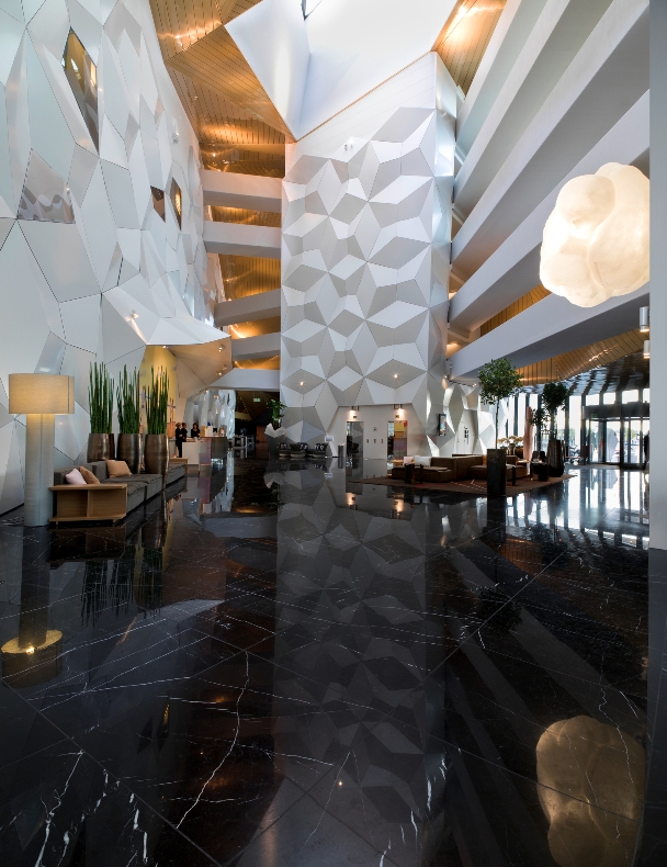
Gary Bates: The lobby space acts as a social catalyst. It was important for us that we managed to make that “interior living room” for the city, especially with challenges such as developer driven logic’s prioritizing simplification and quantification of square meters. The whole project was generated around the lobby with all the interior spaces and public functions agglomerating around it. We were inspired by the kind of John Portmanhotelsin the United States that have these kinds of dramatic atrium spaces and it becomes this special room open and ‘free’ for the city. Especially for this location, where you have at times an imposing climate, it is a luxury to have this incredibly malleable lobby space that is first and foremost a very large covered public space.
GPI: What were your functional and conceptual goals for the lobby?
Bates: In any situation, it is always good ask how a space can be both adaptive but at the same time specific. There was a period in architecture when flexible meant innocuous, a square white room.We had a very specific aesthetic in that room in mind and it was important that they could do exhibitions and large conferences. The lobby is actually split in two, there is a pinch-point in the middle and we have a conference lobby to one side and entry lobby on the other side. The restaurant and entry lobby are connected to the conference lobby and the conference facilities at the pinch-point.
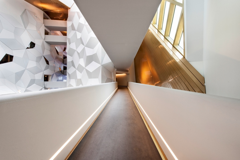
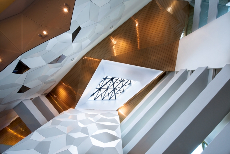
The possibility of shared space was imminent; we wanted the space to flow freely as a whole, including the flows both inside and outside, orchestrated by the natural light conditions. There had to be enough light in that central space, not as visible windows but through the ‘fissures’ of the blocks and the skylight. It is incredibly exciting to see how the occupants utilize the lobby; they have hosted events where a motorcycle drives through the lobby into the conference room, and numerous types of parties with large amounts of people. As people stand on the bridges connecting the wings of the hotel through the void of the central lobby, they can look down through the lobby space and it looks fantastic. When you create a building like that it means having creative clients and in this case, creative users as Choice for the Clarion Hotel. We tried to imagine this kind of thing but we did not imagine vocalists standing on the bridges with a completely packed lobby and music’s resonating in this cathedral like space. It was a beautiful moment. You never know that when you create something, what people are going to dream up.
GPI: How did you use specific design tools (such as color, form, materiality, lighting) to create the space?
Bates: The thing with atrium hotels is that they are based so much on the verticality. You enter the space and the repetition becomes the ornament and by the radical repetition of flow; (when you’re standing looking up 80 stories into the air as in the Grand Hyatt Shanghai), the sheer simplicity and repetition of elements and balconies becomes an aesthetic in and of itself.
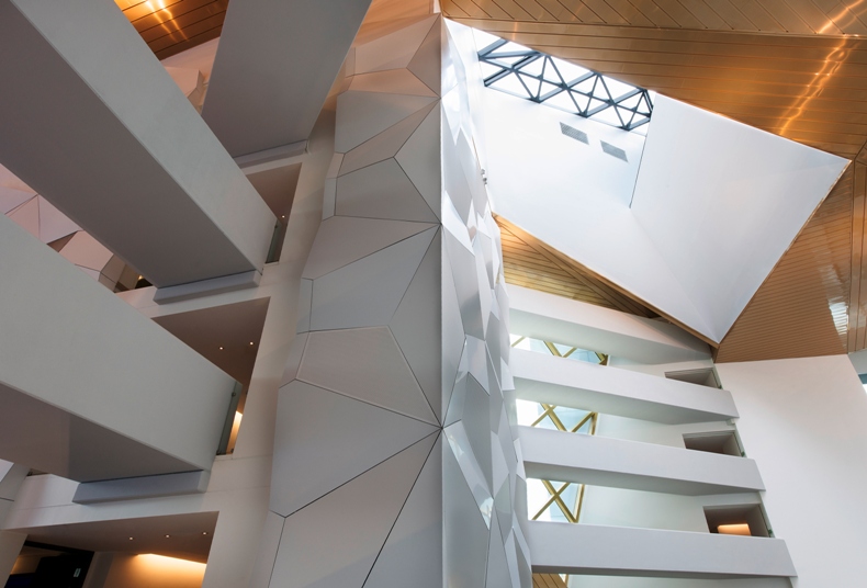
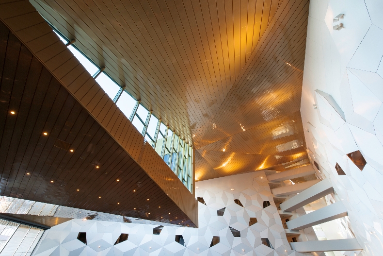
Even though we don’t really have that here and the building is not that tall, it creates that illusion, mediated by textures and light. We worked from a horizontal approach starting with a basic atrium, then we collapsed ‘plan’ so that all of the different wings of the hotel were oriented to specific views. This ‘crumpled’ lobby was pinched in the middle creating two different spaces. Then we started to cut into the volume, letting light slip in horizontally between the slabs. We have this beautiful light coming in to the atrium through these fissures,where natural lighting combined with the large skylight above created this very magical space inside.
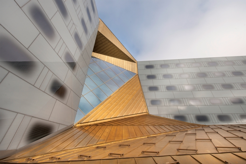
There is always to some degree, cladding in architecture, but with a very restrictive budget, we sought raw, robust, and meanwhile expressive materials. We have pre-fabricated concrete bridges, crossing the atrium, specific and playful. The reflections and patterns in the stone floor deconstruct the banality of grids and directions, inspiring free flow. We made these special origami inspired walls with a very intricate and delicate pattern giving the room texture and enhances the visual movements. The color palette is fairly subdued in the sense that the light reflected with white walls enhances the texture which is a special design element and creates contrast at the base with the dark floor. We work a lot with ornament, down to not just color, but texture and the treatment of the raw materials, inspired by Scandinavian design sensibility; it is interesting for me as an American working in Scandinavian to see this incredibly rough, exotic and sublime landscape.
GPI: What was the biggest constraint in turning this design into a reality?
Bates: The biggest constraint is that the building was largely over budget and when the first prices came in, we had an incredible path to try and bring it within budget. This was an incredible challenge, to come into a dialogue with the general contractors. They have their own ideas of how to do things and we had to try and find a common language to achieve the kind of results we wanted. It takes a lot of effort to find a communication platform that works for both, but as time goes on and your commitment is respected and appreciated you get more and more trust, giving opportunities to affect the design. It was really an evolution in the process from the beginning when we were not at all prioritized, or even worse, perceived as an obstacle. Trust is an incredible asset to the team as people start a design process.
GPI: What makes this space impactful?
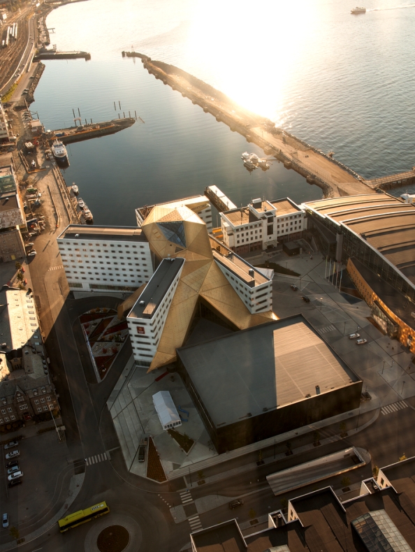
Bates: What I think is impactful about this hotel is that it is accessible for everyone. It has that public component in our case, the lobby is connected to a sky bar, which is connected to an incredible view overlooking the fjord. I think the impactful influence is that it becomes an extension of the city.
The interesting thing was that there was a very mixed reaction to the hotel at the beginning. It was new and people didn’t know how to approach it or what to think about it. There were a lot of critiques in the newspaper saying it was too big or that it was too foreign but at the same time it was in the middle of an industrial area that was just starting to transform. There were a lot of mixed reactions but as it became part of the city and as people started to use it, having events such as weddings, receptions, and conferences, the people began to embrace it. When you saw that excitement, the project really began to take off.
The hotel adds value to the community and that for me is what makes it important, that the city slowly started to adapt and move toward it and enjoy the views from it and those kinds of stories are what makes it impactful. We really found an interesting common ground between having a conference hotel which is on a very strict budget with tight margins, and a strong design. ‘Touch everything’ is one of the principles in SPACE GROUP. The Clarion Hotel is a very strong place, strong in its form and strong in its aesthetic and it is unique in that way for creating a social impact.
______
Many thanks to Gary for sharing the inspiration for this lobby design. For more visual inspiration, follow our Impactful Entry Space board on Pinterest.
Image Credits: SPACE GROUP and photographers Ivan Brodey and Peter Hebeisen

