Impactful Entry Space: Beethoven Offices
In this Impactful Entry Space blog series, we will feature a designer or artist that has created an attention-grabbing design for the main lobby space of a building. Drawing inspiration from completed entry spaces around the world, we travel beyond the image by diving into the design process and concepts behind it.
Today, we feature our interview with Rene A. Mateo of Archit3ctum about the lobby design of the Beethoven Offices in Barcelona, Spain.

GPI Design: What did the lobby space mean to the building as a whole?
Rene A. Mateo: Good question! The lobby is by definition a space of arrival, initial reception, first contact with the interior and also a waiting area, although this is not the case. As an organ indispensable for the building at any of its types, the lobby is transformed into a space of information, control, where the first interactive experience with the set that makes up the interior of the building is generated.
In the case of Beethoven in particular, to the lobby as a transitional space operations operate as connector, link between the Avenue and the plaza, both indoor outdoor is attached since it consists of a corridor that signs such.
The idea that a transitional space becomes a sensory experience, and really define your utility through materials, as well as the physical, psychological and psychic, is what drives the motor power of the architectural entity in which is integrated.

GPI: What were your functional and conceptual goals for the lobby?
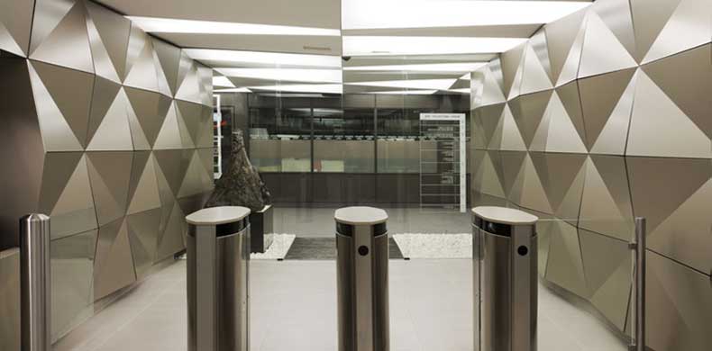
Mateo: In our case the initial function is given with the commissioning of the project to us, the function of connector already existed and input to these functions were added security, the strengthening of information and, above all, control. Our team took all of these requirements and we transformed them into a set where all the elements are directly linked to making everything work in sequence and establishing controls, accessibility, and function according to the indoor use of the building.
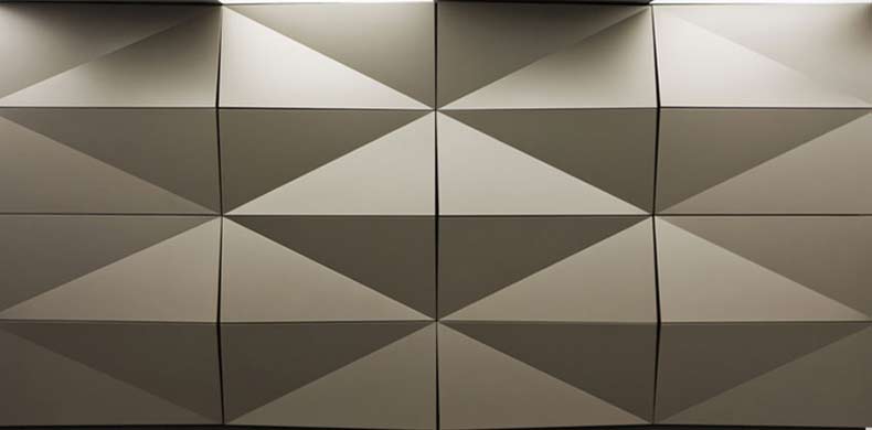
When we started working with the requirements and the process, between so many ideas we are left with the Japanese term “origami” since it is the art and discipline at the same time, because they have to follow a series of patterns to build a figure through the folds of paper. Then to think about the repetitive sequence of these forms or figures with the objective of formal a whole entered in the term “modular origami” and with this idea works the container as a kind of tessellation, where each piece and its function is essential.

GPI: How did you use specific design tools (such as color, form, materiality, lighting) to create the space?
Mateo: To realize our conceptual idea, the first thing to do was to experiment with the folds of paper to make a sequence, or idea of sequence that will help us take the next step. Once finished with the process, we performed a virtual composition that is consistent with the structure and responded to the previously established functional aspects.
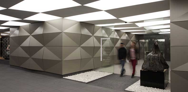
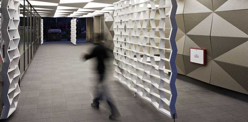
To this we add the idea of exterior interior transition using a current material and that it could fold like paper and could be used both inside and outside the building, this succeeded through a composite of aluminium, with very good performance. We love the idea of using the range of brilliant bronze color, which helped us to highlight the plans created figures and its reflective characteristics contributed more light into the space. We supplement this material with ceilings and lighting using tensioned PVC characteristics of flexibility and translucency us seemed to be great to be able to make a very well defined and balanced lighting board with other elements. As a physical limit we designed two doors that follow the same sequence of folds, but in this case made of iron and once open serve as a sieve which directs the access from the street and the square.
Respecting the sculpture on the right side of the inner access we used white stone to make your rest more comfortable and give a less formal look to this transition. Exterior/interior separation is through crystals which let the script visually but thermally isolate both spaces. The flooring both inside as outside are in tones close to grey in order to cause you to lose protagonism, although in the case of the outside combine parts like a puzzle that only is displayed as you move through the passage.
Finally, we managed to combine all these materials in wrapping coherently the activities carried out during the stay or transition from the lobby and the passage.

GPI: What was the biggest constraint in turning this design into a reality?
Mateo: One of the biggest obstacles is currently, the physical time to perform works when the building is operating at 100% and we have very fair design and execution times. Having said that, combine all materials so that they fit perfectly and comply with the functional and technical aspects required, a reform of this kind where we had little height and work with folds on the ceiling, the fact to make sure the light is uniform on the panels was a quite interesting work as well as the process of assembling the puzzle and that each piece has a different function, it seemed a challenge but very funny turn.
GPI: What makes this space impactful?
Mateo: I think what makes it more impressive is the sequence of folds, hard to find a space where each element is thought of and directly related to others, without being monotonous, is also a space that contrasts dramatically with its immediate surroundings. One of the claims of the design was the fact that it projects a strong corporate image of being contemporary and current, but neutral, since different companies within the building are housed.
We have managed to make the transition through the Hall a memorable architectural experience.
______
Many thanks to Rene for sharing the design inspiration for this space. Stay tuned to our next Impactful Entry Space interview coming up in two weeks. For more visual inspiration, follow our Impactful Entry Space board on Pinterest.
Image credits: Architectum
