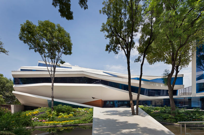
Impactful Entry Space: Roberto Cantoral Cultural Center
In this Impactful Entry Space blog series, we will feature a designer or artist that has created an attention-grabbing design for the main lobby space of a building. Drawing inspiration from completed entry spaces around the world, we travel beyond the image by diving into the design process and concepts behind it.
Today, we feature our interview with Gerardo Broissin of Broissin Architects about the lobby design of the Roberto Cantoral Cultural Center in Coyoacan, Mexico.
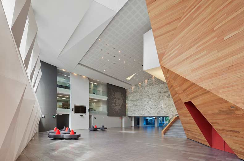
GPI Design: What did the lobby space mean to the building as a whole?
Alejandra Carranza: It is the heart of the building. Without it the concert hall would be useless, like a king without his crown.
GPI: What were your functional and conceptual goals for the lobby?
Carranza: It serves as a multifunctional space, you can use it just for passageway by distributing the visitors to the gates, as a reception hall after the concert; even there have been parties in there where the venue is not in use.
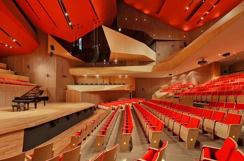
GPI: How did you use specific design tools (such as color, form, materiality, lighting) to create the space?
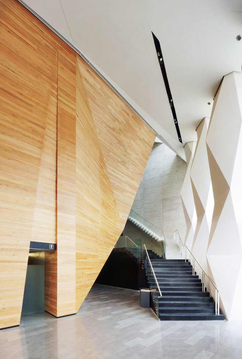
Carranza: The concert hall is red! Seating in red, ceiling in red, so what we tried to do was to maximize the impact of the vivid color inside the concert hall by using neutral colors on the lobby. All the surfaces are gray ones and just in the back aisle the natural color of the cedar wood as an introduction of what you are going to affront inside.
GPI: What was the biggest constraint in turning this design into a reality?
Carranza: This is the venue of the Mexican Composers Association, so there was a lot of politics in there and, as is natural, different approaches on what were the true needs. Some of them did not want the venue, some others yes but smaller, and later on when everybody was agreed on what they really want, the budget issue sparked and there began another challenge.
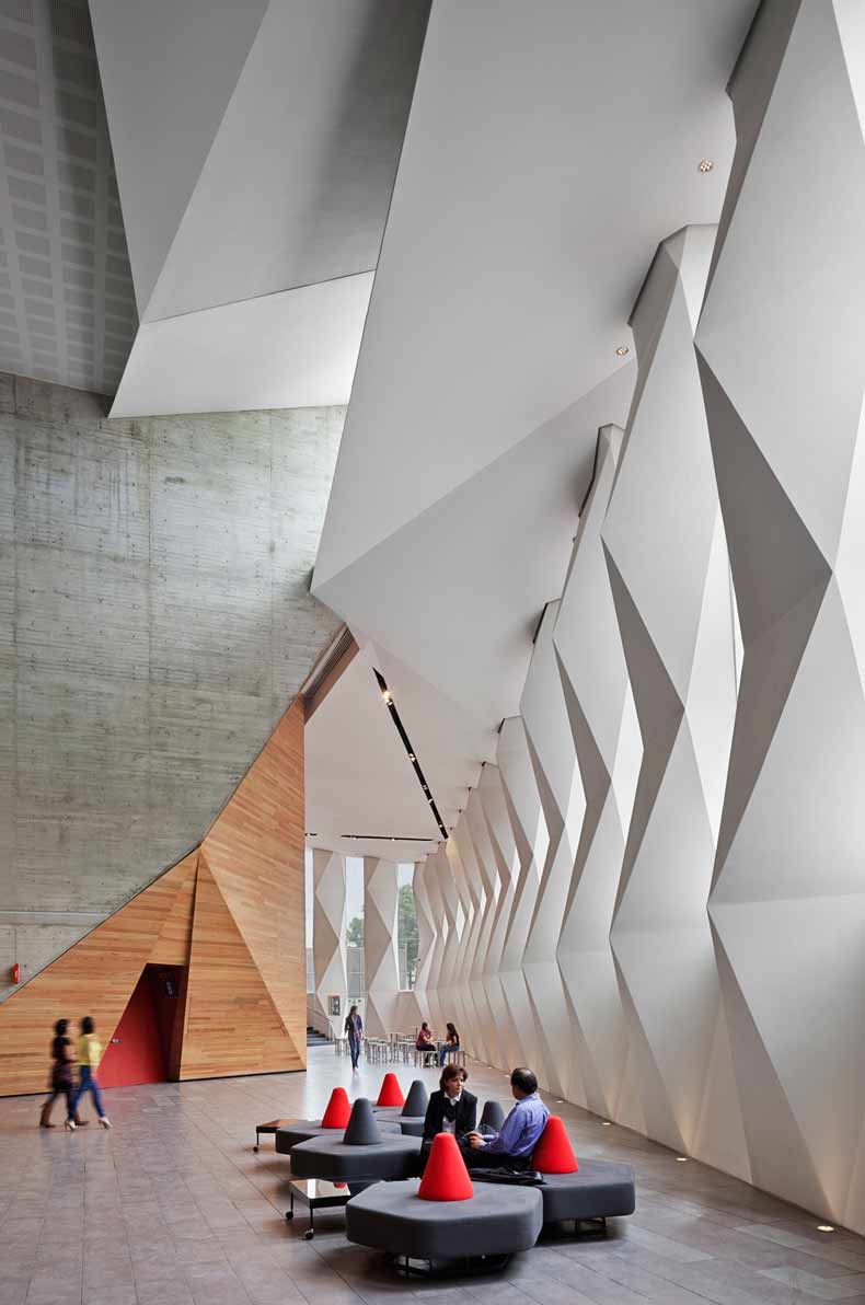
GPI: What makes this space impactful?
Carranza: I guess that you never know what you going to see in terms of space, since the urban scale as the building is inserted in a small old colony usually designed for habitation. Suddenly you find a small woodland with this bright white building and when you are approaching to it you never guessing the real size of it because a perspective design trick. So when you pass the main access to get inside, you pass over a 12ft tunnel of 8 ft height to the lobby which is 47 ft in height, and if that were not enough to get the visitors surprised at that moment they just have seen whites and grays, so when they are wrapped in red, the sensation is great actually. Even when I come back I always can feel that energy the arrival sequence transmits.
______
Many thanks to Gerardo for sharing the design inspiration for this space. Stay tuned to our next Impactful Entry Space interview coming up in two weeks. For more visual inspiration, follow our Impactful Entry Space board on Pinterest.
Image credits: Broissin Architects and Paul Rivera via Arch Daily

