Impactful Entry Space: Museum of Fire
In this Impactful Entry Space blog series, we will feature a designer or artist that has created an attention-grabbing design for the main lobby space of a building. Drawing inspiration from completed entry spaces around the world, we travel beyond the image by diving into the design process and concepts behind it.
Today, we feature our interview with Oskar Grabczewski of OVO Grabczewscy Architekci about the lobby design of the Museum of Fire in Zory, Poland.
GPI Design: What did the lobby space mean to the building as a whole?
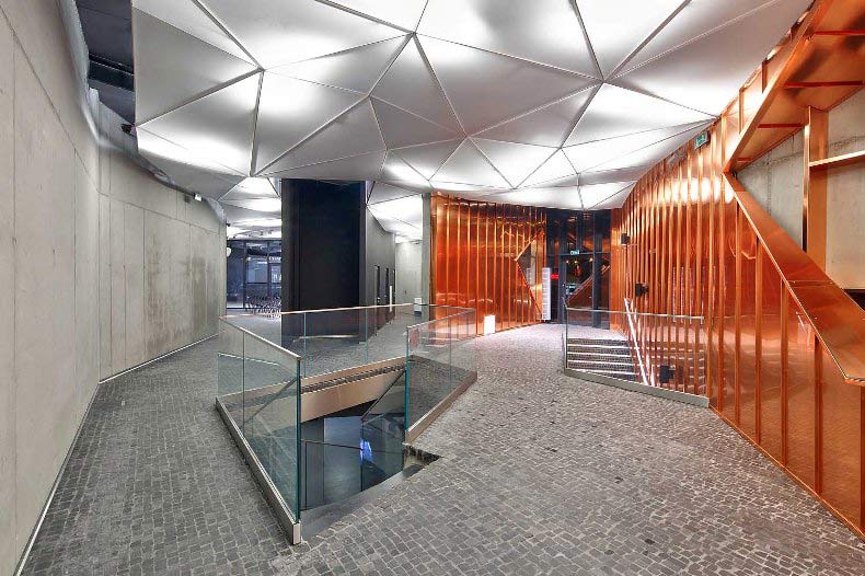
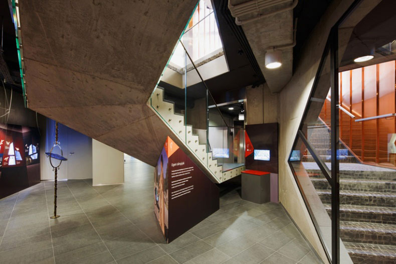
Oskar Grabczewski: The building in fact is a continuous lobby. The Museum has three entrances and they are all connected via uninterrupted, flowing, multifunctional space – a lobby that is also an exhibition hall. Our idea was to create continuity between outside and inside of the building.
GPI: What were your functional and conceptual goals for the lobby?
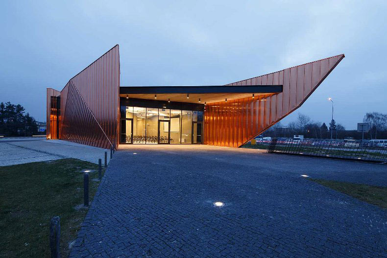
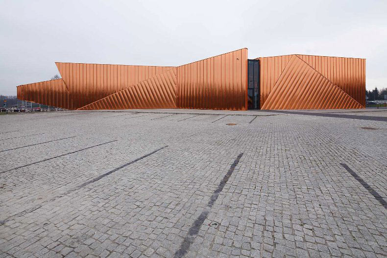
Grabczewski: The lobby is the most important space in the building. It contains reception, exhibition and multifunctional spaces connected to each other. Our concept derived from the name of the city – Żory means “fire”, ”burnt”, “flames”. In XII century, when Żory was founded, forest was burnt in order to create free space for the new city. This tradition is still alive – there is a Festival of Fire in summer, and the logo of the city is a small Flame. It became obvious to us, that a building should look like a fire. The strange shape on the plot suddenly started to resemble dancing flames and the idea started to crystallize.
GPI: How did you use specific design tools (such as color, form, materiality, lighting) to create the space?
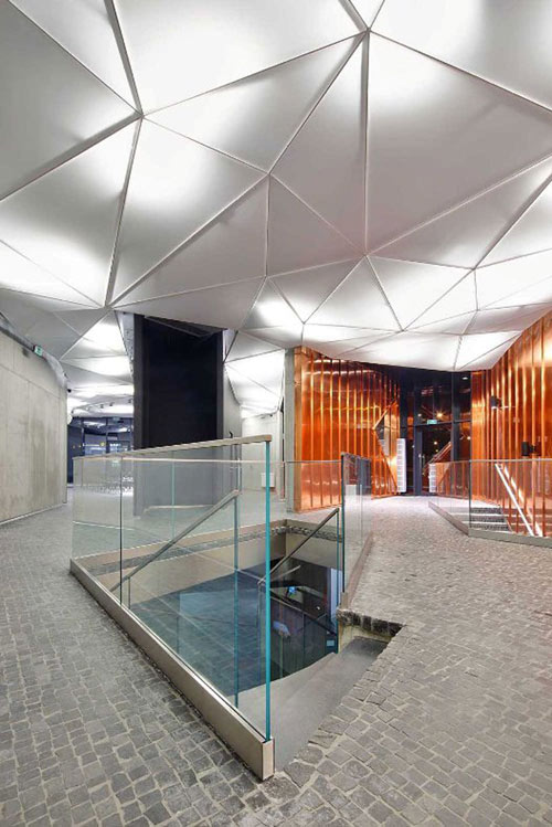
Grabczewski: All materials has been chosen according to the main topic of the Museum – that is the phenomena of fire. Fiery copper cladding comes from the outer walls inside, as single flames. The black granite paving stones also flow from outside inside. The walls inside are gray and black – the museum is “fiery” outside, but “burnt” inside. The ceiling is based on triangular pattern similar to the basic geometry grid of the building.
The building consists of three independent walls that “swim” next to each other. Their composition and shapes covered with copper plates resemble dancing flames. Copper is covered with HDP layer in order to avoid patina and keep fiery appearance. Spaces between the walls are fully glazed forming entrances to the pavilion. Walls are made of architectural concrete, covered on the outside with copper and left untouched inside. The floor is paved with black stone, and continued to the outdoor elements.
Intensive landscaping is surrounding the Museum. The building and the landscape work together create a symbiosis of space consisting of Museum itself, pedestrian paths running through the pavilion and green walkways. There is a Garden of Fire foreseen – an outdoor exhibition space along the country road nr 81 that will be used during Festival of Fire.
GPI: What was the biggest constraint in turning this design into a reality?
Grabczewski: We had much trouble finding material that looks fiery but doesn’t age nor oxidize. It took us a lot of time to find the final solution – copper covered with thin HDP varnish similar to car lacquer.
GPI: What makes this space impactful?
Grabczewski: The space has original geometry, high quality materials and good proportions, but the most important thing is that the lobby corresponds to the whole of the building and expresses the main idea of the building – notion of fire as physical, cultural and social phenomena.
______
Many thanks to Oskar for sharing the inspiration for this lobby design.. Stay tuned to our next Impactful Entry Space interview coming up in two weeks. For more visual inspiration, follow our Impactful Entry Space board on Pinterest.
Image credits: Tomasz Zakrzewski via OVO Grabczewscy Architekci

