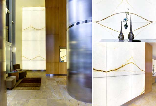
10 Design Elements for Creating Commercial Feature Walls
Have you ever seen an over scaled-zebra striped-curved-colored-lighted wall with varying panel sizes and gaping reveals? We haven’t, but there’s probably a reason for that. All of the conflicting visual elements would cause nausea and headaches for any sane designer!
In a primary space in your commercial interior design, you’ve allocated a prominent wall which has to pull the eye as soon as the user enters your building. Or you need to set the mood in a swanky restaurant with a dramatic focal point. Considering the plethora of material and color choices alone, it’s easy to get swept up in all of the bells and whistles. Beware, using more than 4 or 5 dramatic design elements will result in visual overload.

Constraining design choices can often generate more simple and sophisticated interior designs. While we’re certainly advocates of highlighting the materiality of stone or glass as center stage in our interior feature walls, there are other design tools which should be considered and manipulated. While all of these aspects (whether prominent or downplayed) exist in every feature wall, elegant statements are achieved by employing 2 or 3 of the following elements in a hierarchical fashion:
1. Color
Color drives many of the material selections for commercial interiors. Colors that occur most frequently in natural materials are greens, blues, and browns. Man-made colors are available in a wide range, with an equally wide range of emotional reactions to those colors. The eye will be drawn to the area of greatest contrast first. Generally, bright vivid color combinations produce startling dramatic effects, and less bright colors tend to produce a soothing atmosphere.
Highly contrasting colors will make the wall advance and make the room appear smaller. If you are working in a small or dimly lit space, consider using RGB light to create the coloration of the surface. Could the surface material fade into the background and act as a canvas for light?
2. Scale
There are several dimensions of scale to consider when designing commercial feature walls. At a large scale, the proportion of the feature in relation to the surrounding space will affect visual perception. Should the wall reinforce the strong verticality in a tall lobby space? Should a backlit feature wall have a horizontal force that pulls users through a long corridor?
Shifting scales down to the human body, pay attention to the relationship between the human body and the feature wall. How does it feel to stand next to the wall (imposing, comfortable, energizing)?
Where is the primary view of the wall located- in front of, below, above? How far away is the user when he/she first visually interacts with the wall?
Whether the design surface is wood, stone, glass, resin, or fabric, the scale of the individual panels that compose the wall affects the perceived size of the entire wall. Other things to consider include the scale of any surface patterns and finish trims. Where should seams be placed?
3. Material
The available choices of interior finishes can be seemingly infinite. Take cues from the materiality of the surrounding spaces in order to guide your material selection. Is the intent to provide a natural, harmonic spatial quality that brings the outdoors in? Perhaps an onyx natural stone or wood surface is the appropriate surface choice. A sleek modern feel with man-made materials? Consider using recycled glass, backlit resin panels, or carved MDF panels.
4. Light
Should light be incorporated? Is the material translucent? Should it be backlit? Is the material opaque? Should the wall be edge-lit or down-lit? Is the quality of light soft, glowing, bold, colored? Directional, diffuse, linear? What is the surrounding lighting environment?
5. Form
Is the feature wall designed to be curved or linear? Is the design intent to appear as a heavy monolithic entity or a thin floating plane?
6. Depth
Is the feature wall surface a single plane, or should it turn a corner or have a return? The intended perception of depth can provide guidance on the design of form, shape, and architectonic details (how the connections and joints of a built assembly are expressed or suppressed).
7. Pattern
Often used in lower-end finishes, pattern shifts the focus from the materiality of the surface to the visual perception of that surface. Is the surface pattern organic or geometric? Does the pattern interact with the form/shape of the feature wall? Be wary when combining bold patterns with bold forms; the two strategies will visually compete and overwhelm occupants of your space.
8. Texture
The perceived degree of roughness and smoothness in surface quality can be either tactile or visual. Distance alters our perception of texture; one must view fine textured objects at close range in order to see the texture. When viewed from a distance, fine textured surfaces blend into a single tone and appear flat. Coarse textured objects are distinguishable from greater distances. The infinite variety of textures that we experience in our daily lives is responsible for a great deal of our perception of objects and our visual interest in both natural and manmade features.Texture can also be implied, particularly through surface design and the manner in which it integrates with light. Light itself can have texture- smooth, dappled, diffuse, or linear.
9. Detail
Scale of the detailing and finishes: exaggerated connections can interrupt surfaces and patterns while minimal seams and details showcase the feature wall surface.
10. Durability
The design surface as well as the feature wall system should physically durable (resistant to fading and scratching), but other design considerations include life cycle and maintenance. Should a classic wall design outlast fleeting trends- or is a trendy statement necessary to support the overall design aesthetic?
What are the most memorable feature wall statements you have seen? What made them so memorable? What elements in the above list were employed, and in what order of importance? What elements would you add to the list?
