Intersection of Lighting Design and Wellbeing
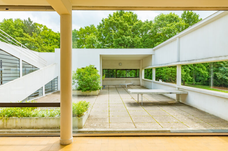
Design Dialogue: Exploring Trends in the Design and Architectural Industry Last week, we explored the significance of natural light in architectural design, highlighting its role in creating biophilic spaces that promote well-being and productivity. Natural light, often referred to as the “golden standard” in lighting design, mimics the dynamic qualities of the sun, influencing our […]
Read more